A Tip-to-Toe Renovation in Hunters Creek Village

This house was originally a custom build from the 1950s. The clients purchased this home and lived in it for about a year before they decided to remodel. During this time, they really got to know and understand what changes and updates they needed. This approach really paid off as this major home renovation moved seamlessly especially with the work of @katiedavisdesign. The result was a truly beautiful and perfect home for this family of five.

Some highlights of this renovation: We moved the kitchen from the north side to the center of the home. We converted an unusable game room into an office overlooking the backyard. We created more space for the home, adding ~300 square feet. We rebuilt and relocated the staircase. We built a covered porch in the front and back. We added a second fireplace.

The Exterior - Before.

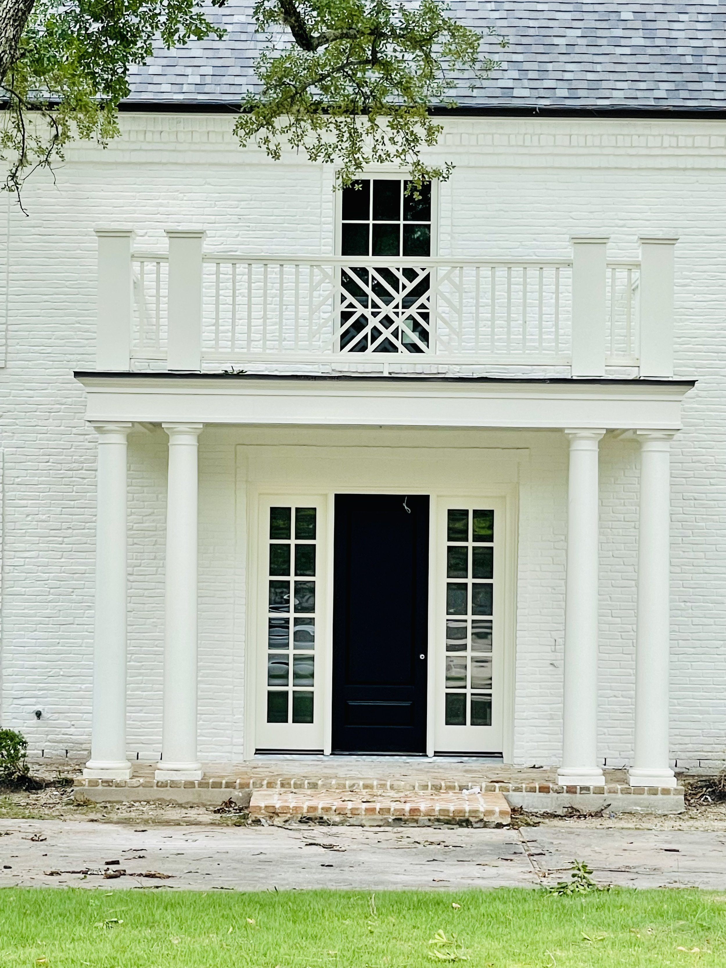
The Exterior - After. A fresh look to a classic Georgian architectural style home from the 1950s. We built a front porch, which not only provides cover outside the front door but also adds layer of detail to the front elevation. The second floor of the porch has a chippendale railing.

The Exterior Transformation.

The Entrance - Before.

The Entrance - After.

The Formal Living Room - Before.

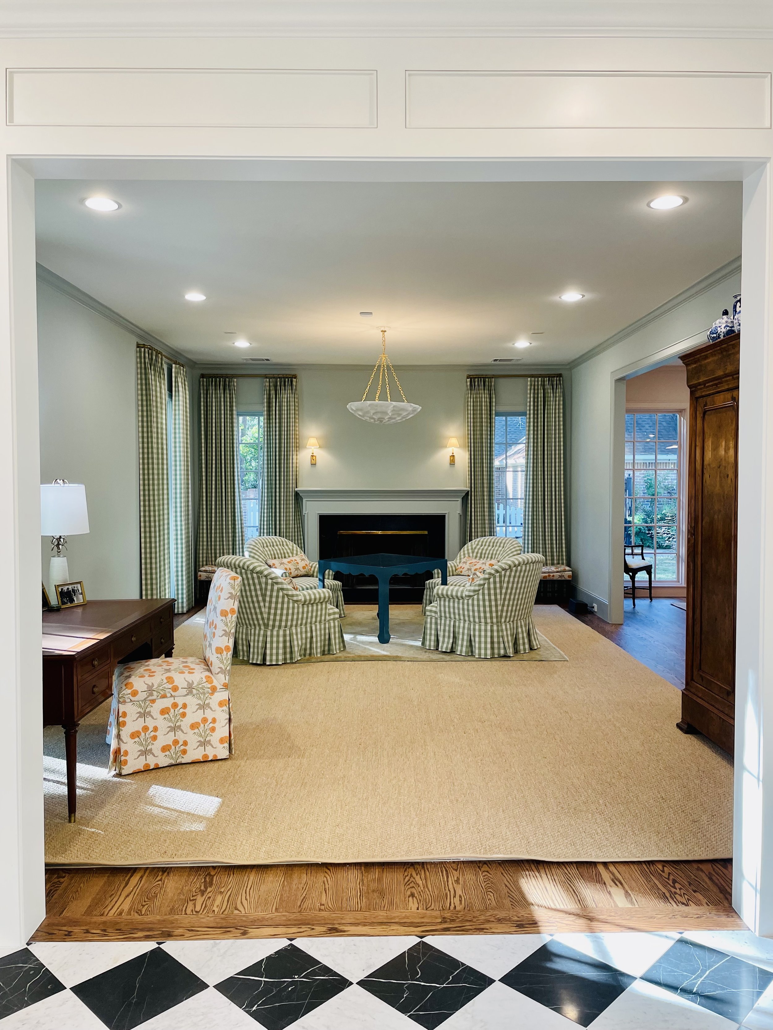
The Formal Living Room - After.

Great Room - After.

The Kitchen - Before.

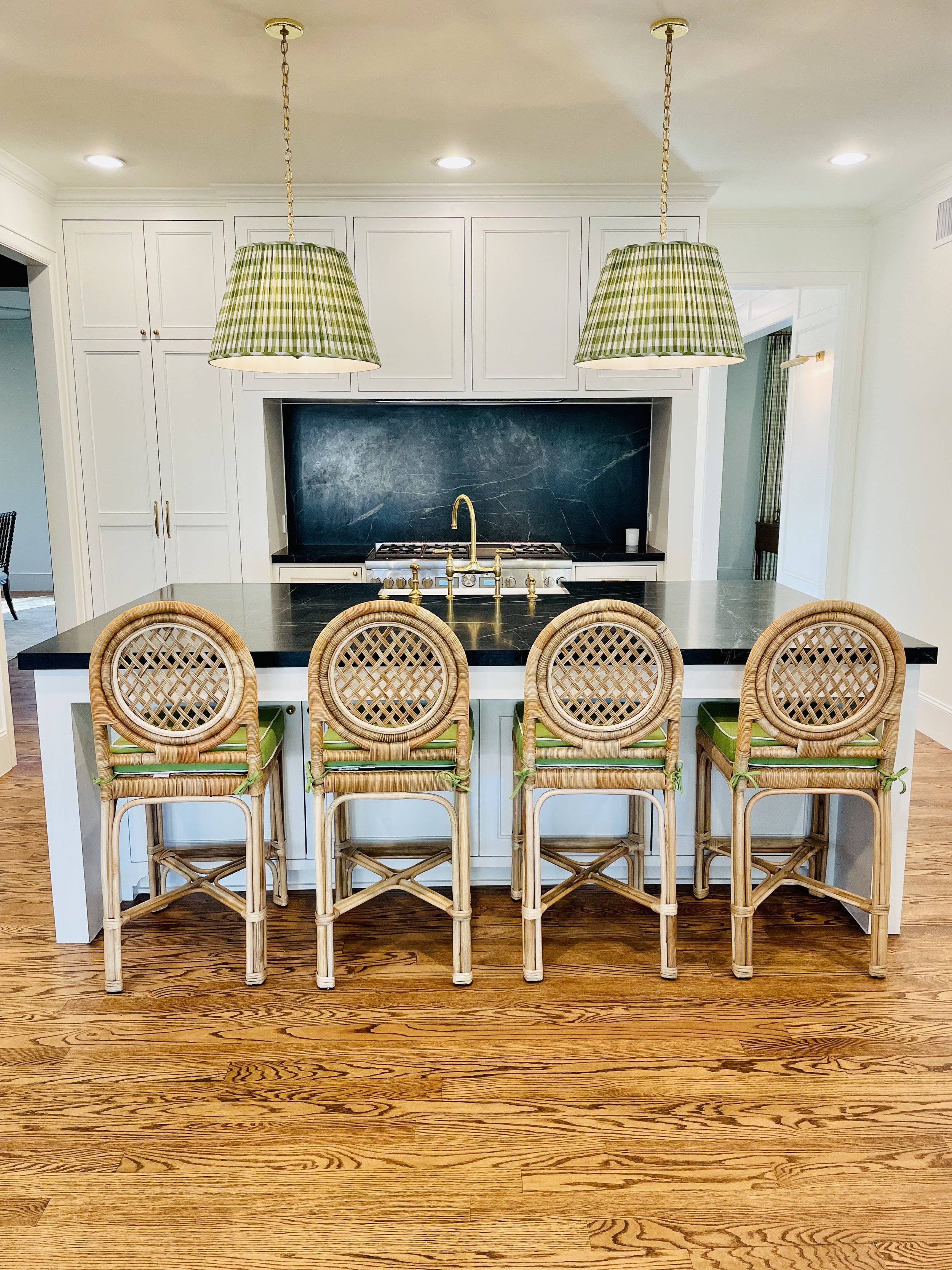
The Kitchen - After.

The Dining Room - Before.

The Dining Room - After. The ceiling treatment is exquisite.

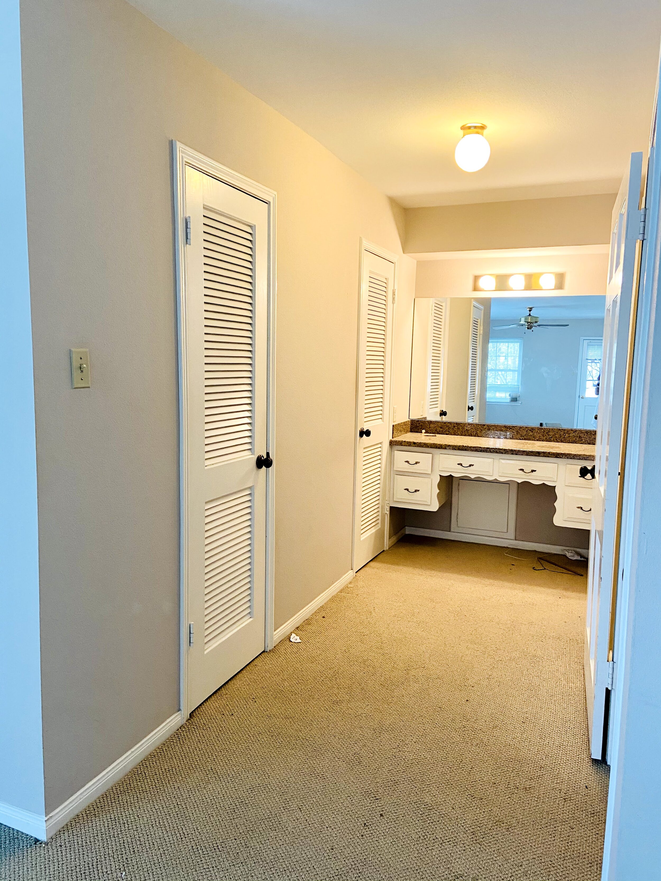
Master Bath - Before.

Master Bath - After. The real wood floors in the chevron pattern make this bathroom very stylish and unique.

Master Bath - After.

The Silver Lining of Winter Storm Uri

Winter Storm Uri was a catastrophic weather event in February 2021 that impacted millions of lives across Texas. Practically everyone we knew in the Houston area lost electricity and water for extended periods of time. With the freezing temperatures many homes were damaged due to frozen pipes bursting.

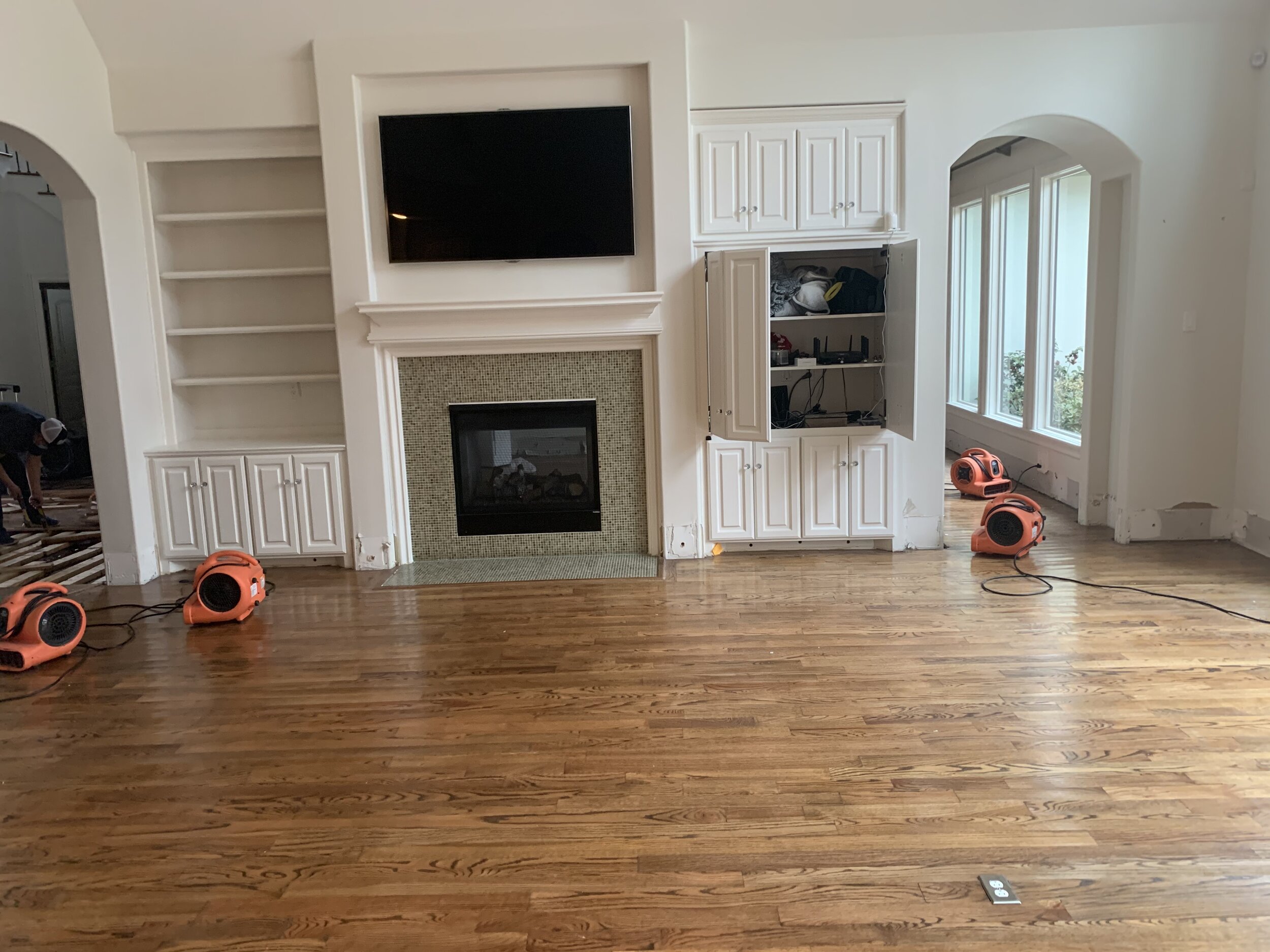
These clients had a plumbing pipe freeze and then break, causing water to flood the first floor of their home. The home sustained damage to the hardwood floors, tile, baseboards, carpet, fireplace, and cabinets. Since they were already having to do a major remediation, these clients took the opportunity to renovate and update their home.

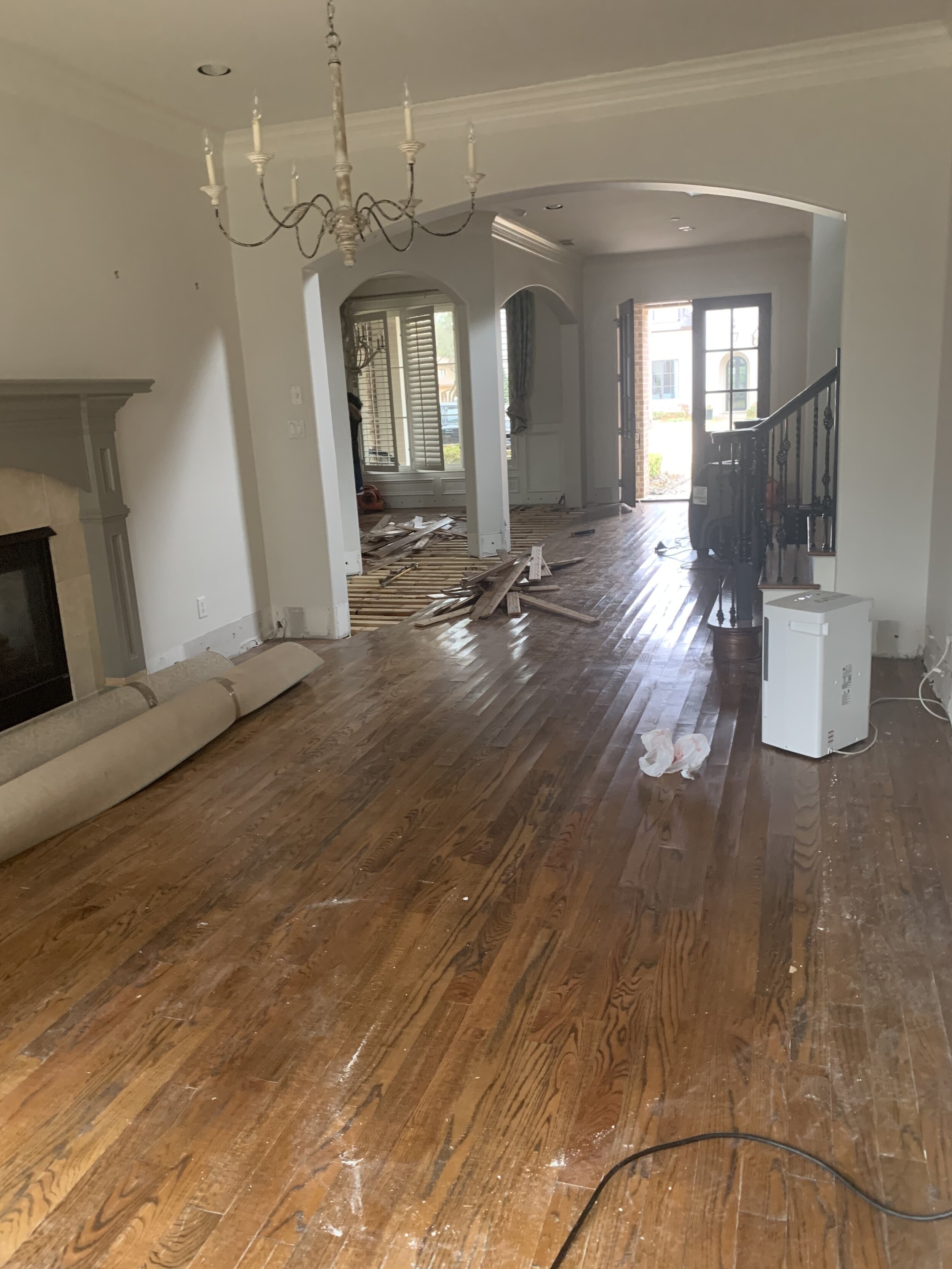
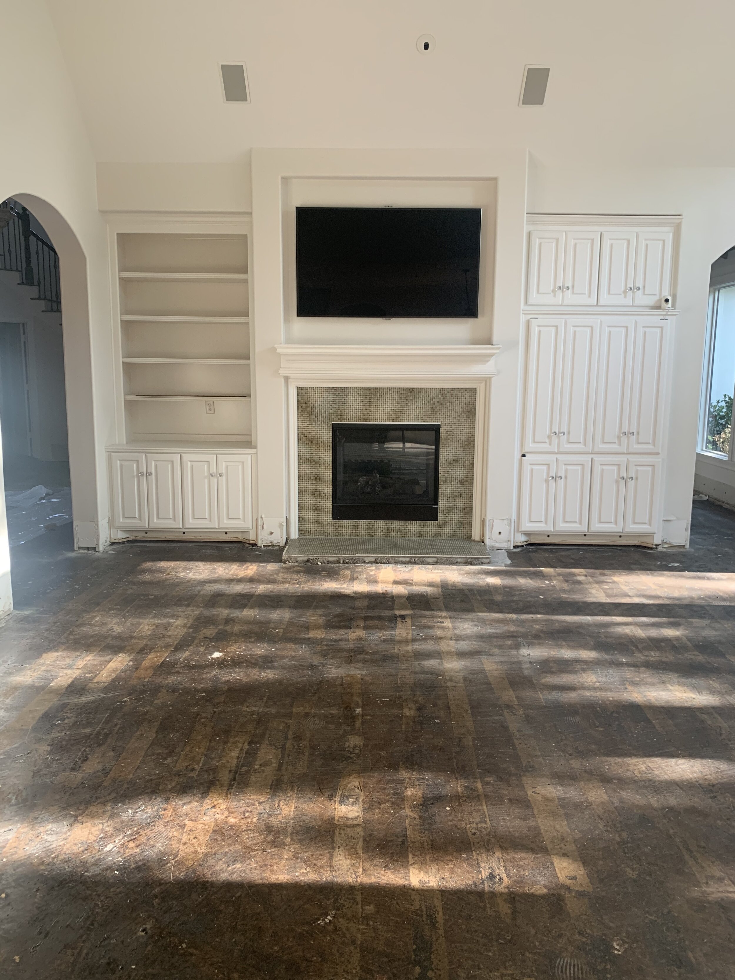
All of the existing hardwood floors had to be stripped and tossed due to the water damage.

All of the existing hardwood floors had to be stripped and tossed due to the water damage.

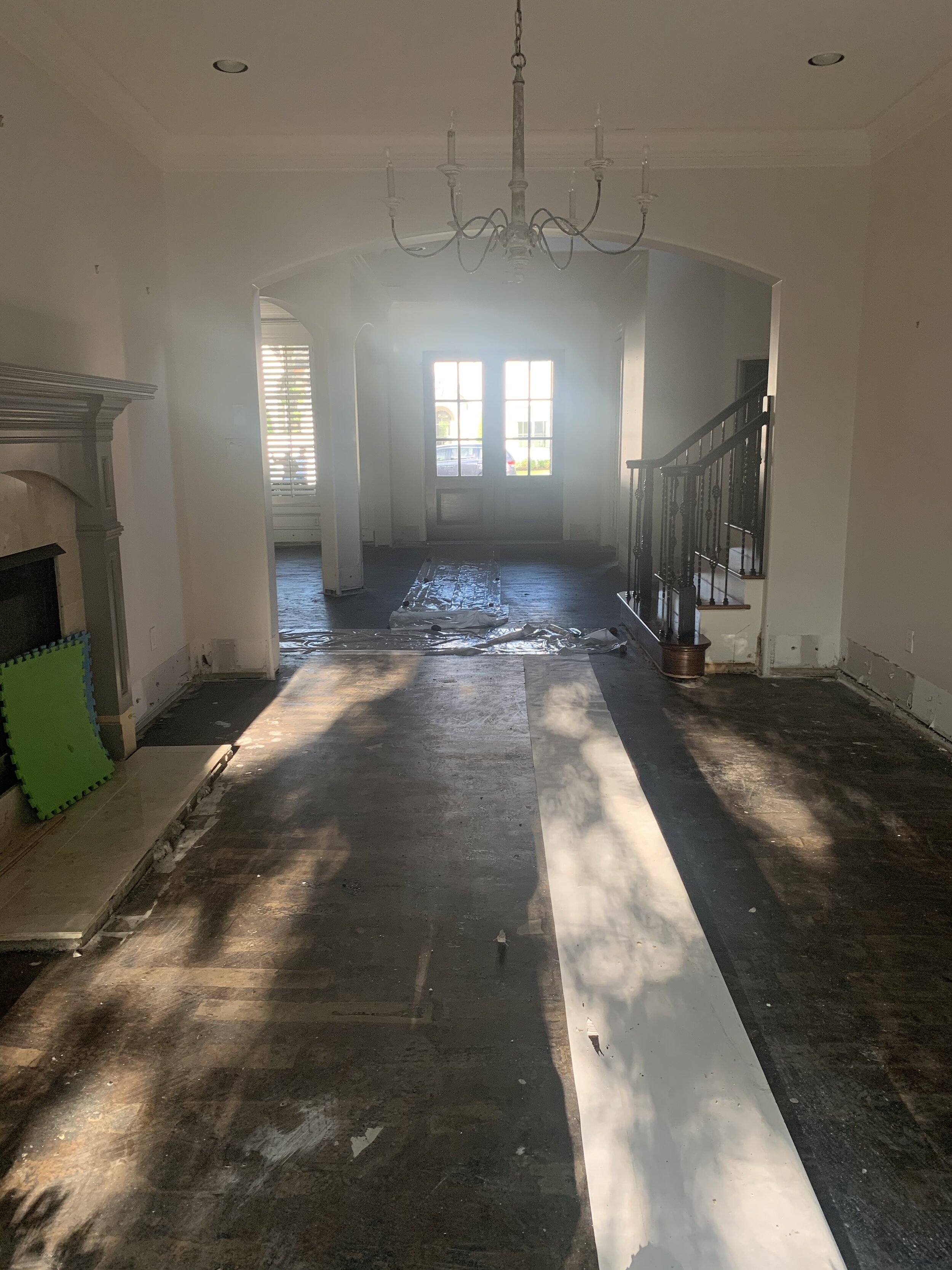
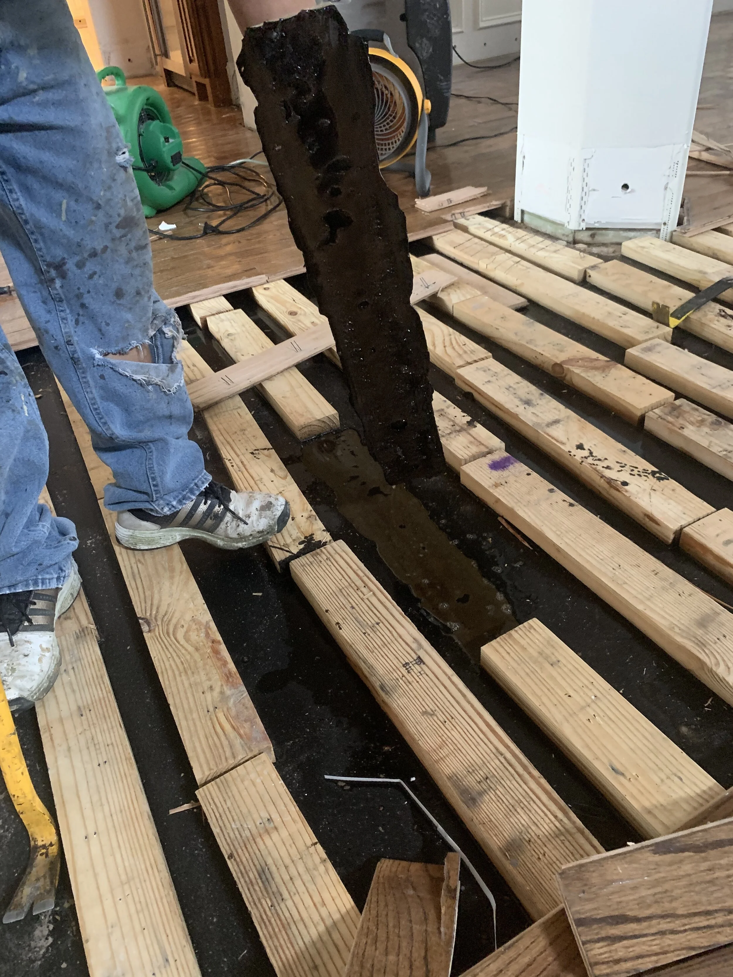
The water damage loosened all the screeds from the tar. This required us to remove all the screeds.

The water damage loosened all the screeds from the tar. This required us to remove all the screeds.

The Dining Room - Before.

The Dining Room - After

The Dining Room - After

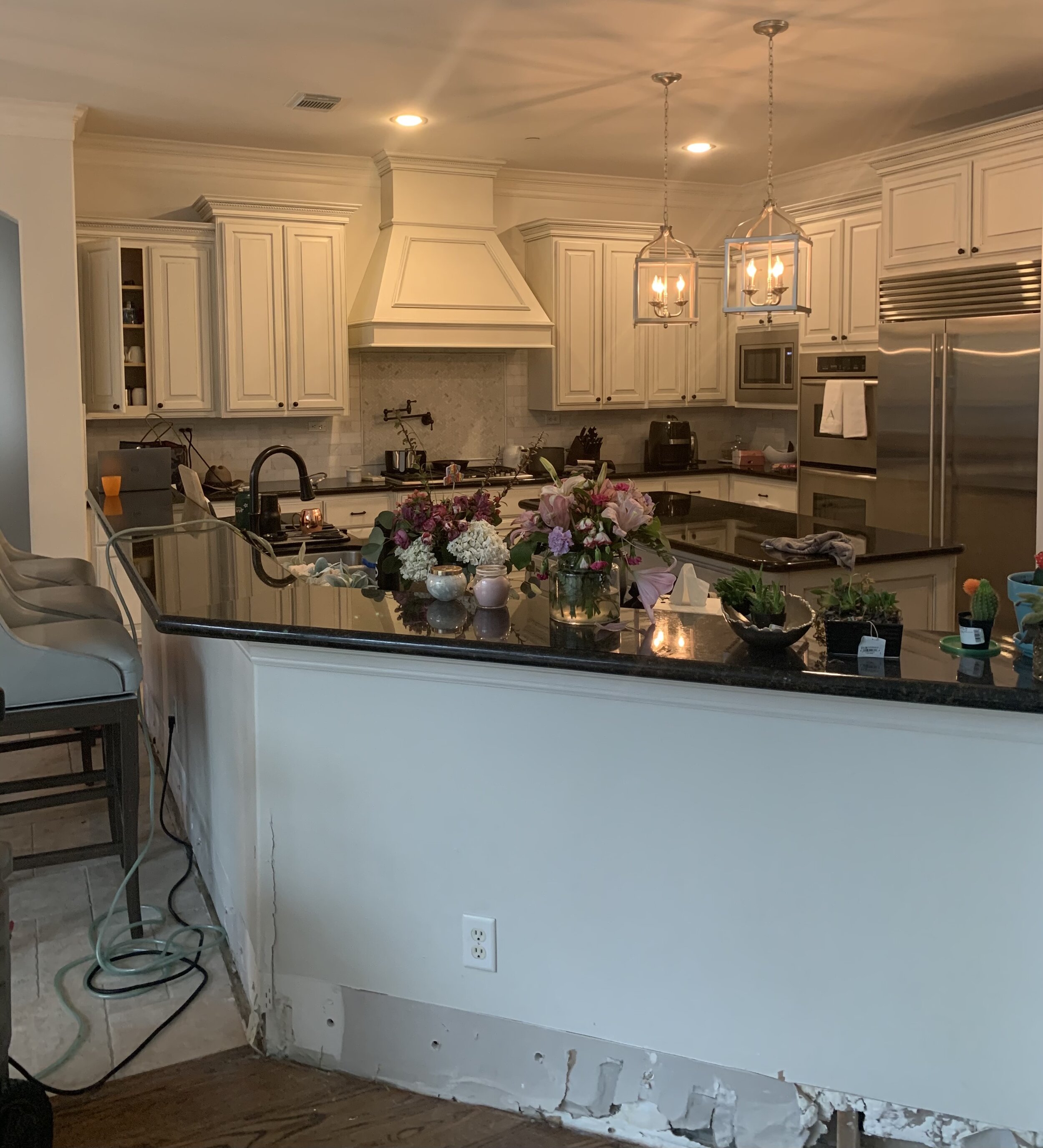
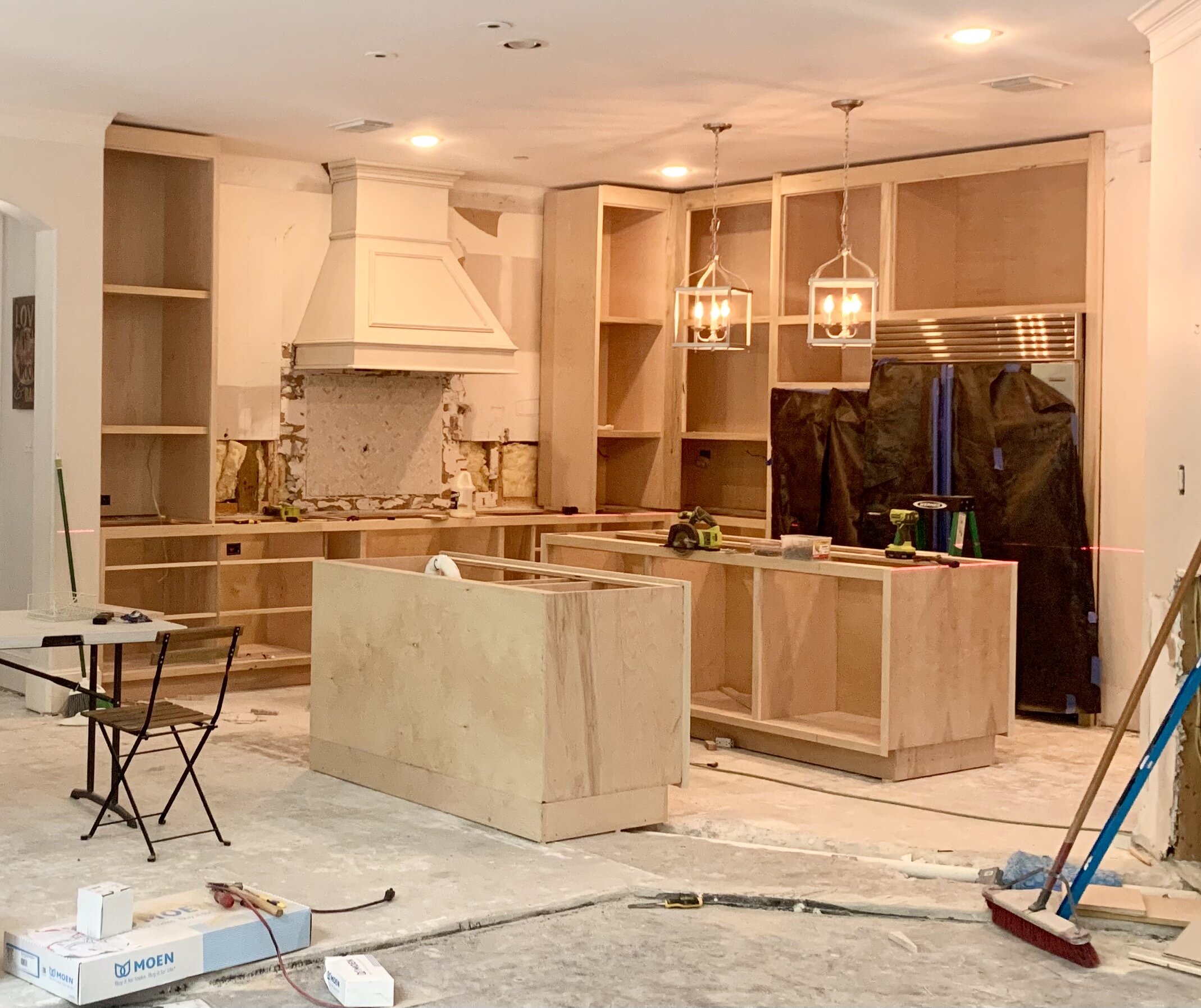
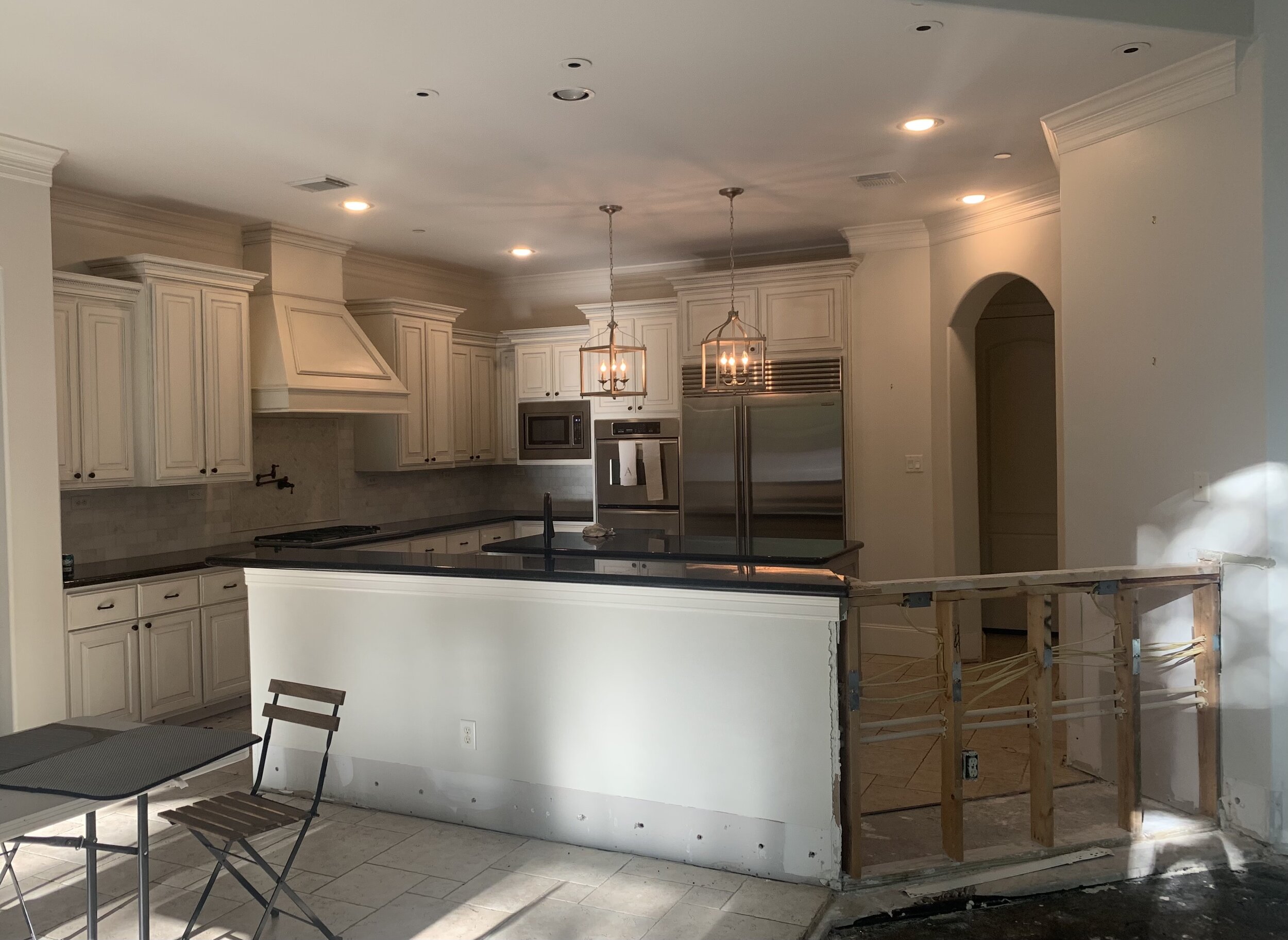
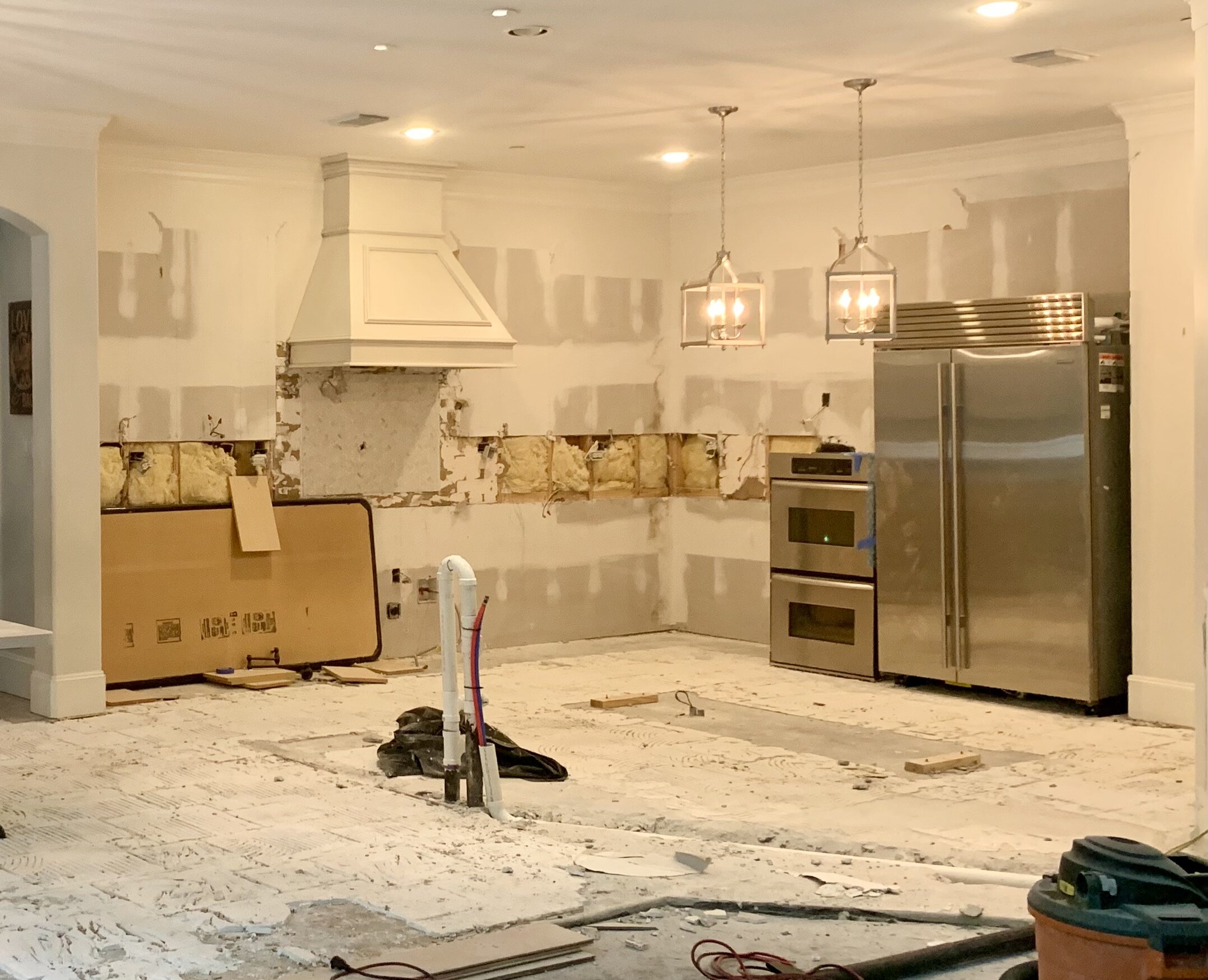
The Kitchen - Before. The photos above show the transformation of the kitchen during construction.

The Kitchen - After. Prior to renovation the kitchen had an extended bar that restricted access into the kitchen. We removed it and installed a double island, allowing for better flow in the kitchen. We also redesigned the cabinet layout.

The Kitchen - After. Prior to renovation the kitchen had an extended bar that restricted access into the kitchen. We removed it and installed a double island, allowing for better flow in the kitchen. We also redesigned the cabinet layout.

The Kitchen - After. The black vent hood creates a focal point along the white stone wall.

The Kitchen - After. The black vent hood creates a focal point along the white stone wall.

The Living Room - Before.

The Living Room - After. We balanced out the built-ins by making each side symmetrical, furred out the wall above the fireplace to allow for a larger TV, and upgraded the fireplace with a marble surround and custom millwork.

The Living Room - After. We balanced out the built-ins by making each side symmetrical, furred out the wall above the fireplace to allow for a larger TV, and upgraded the fireplace with a marble surround and custom millwork.

The Living Room - After. Another view.

The Living Room - After. Another view.

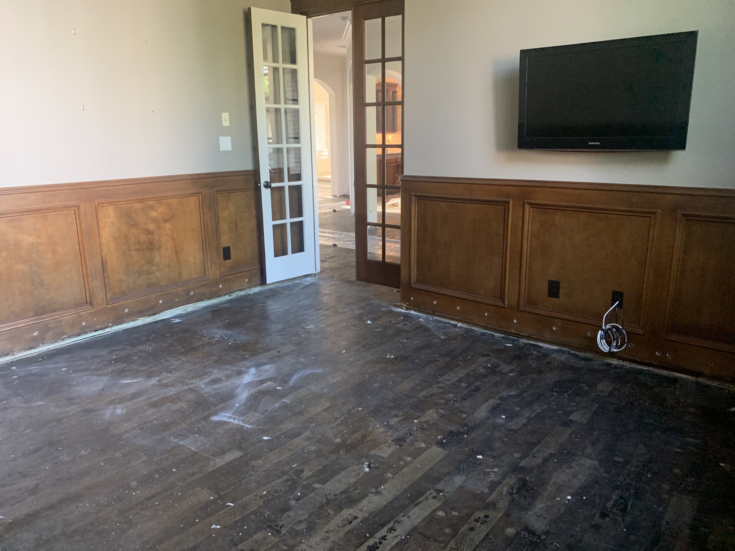
The Office - Before.

The Office - After.

The Office - After.

The Bar Area - After.

The Bar Area - After.

The Master Closet - After.

The Master Closet - After.

The Master Shower - After.

The Master Shower - After.

The Master Bath - After.

The Master Bath - After.

Elevating a Home

In this major home renovation, Ly Custom Homes was tasked with raising the foundation of an existing 4,000+ square foot home. The end result is that the finished floor of the home is roughly seven inches higher, which is 12 inches higher than a 100 year flood event. Although this home has never flooded, an elevated foundation provides the homeowners some relief during Houston’s frequent storms.

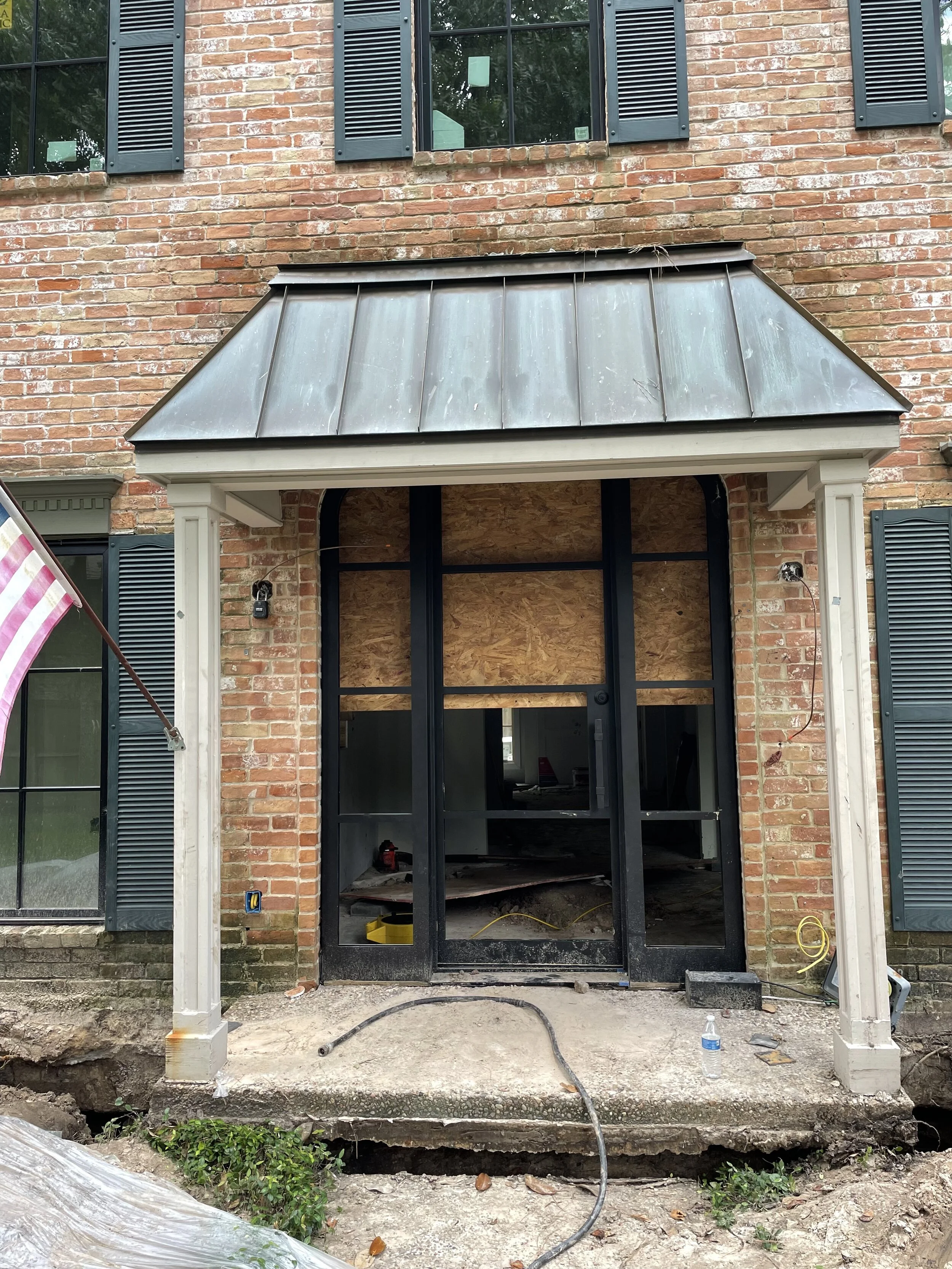
This photo shows the elevation before it was raised. We had to expose the perimeter grade beams of the foundation every six feet.

This photo shows the elevation before it was raised. We had to expose the perimeter grade beams of the foundation every six feet.

This is a photo after the foundation was raised. At the edge of the porch floor, you can clearly see that the home is elevated.

This is a photo after the foundation was raised. At the edge of the porch floor, you can clearly see that the home is elevated.

The general process of how to elevate a foundation is as follows. First we had to locate and expose the load / lift points under the home. There were over 100 of these points around the perimeter and inside the home.  Then we placed a concrete block…

The general process of how to elevate a foundation is as follows. First we had to locate and expose the load / lift points under the home. There were over 100 of these points around the perimeter and inside the home. Then we placed a concrete block in each cavity to serve as a platform for the hydraulic lifts, which are the machines that would be used to lift up the home.

Next we drove down these concrete cylinder blocks 12 feet underground. These would serve as the permanent pier that supports the elevated foundation.

Next we drove down these concrete cylinder blocks 12 feet underground. These would serve as the permanent pier that supports the elevated foundation.

The above photo shows the pressure machine driving the cylinder underground.

The above photo shows the pressure machine driving the cylinder underground.

The crew are working in the cavities to prepare the house lift.

The crew are working in the cavities to prepare the house lift.

More cavities in the ground.

More cavities in the ground.

Lastly, the crew lifts the house using about 20 hydraulic lifts at a time, raising each section of the home 1/2 inch at a time. We performed this same cycle around the house until the home was elevated by seven inches. The entire process took two days.

Lastly, the crew lifts the house using about 20 hydraulic lifts at a time, raising each section of the home 1/2 inch at a time. We performed this same cycle around the house until the home was elevated by seven inches. The entire process took two days.

Backyard Renovation

After months in lockdown, this family in the Memorial Villages was ready to transform their outdoor living space. Below is a before photo of the backyard.

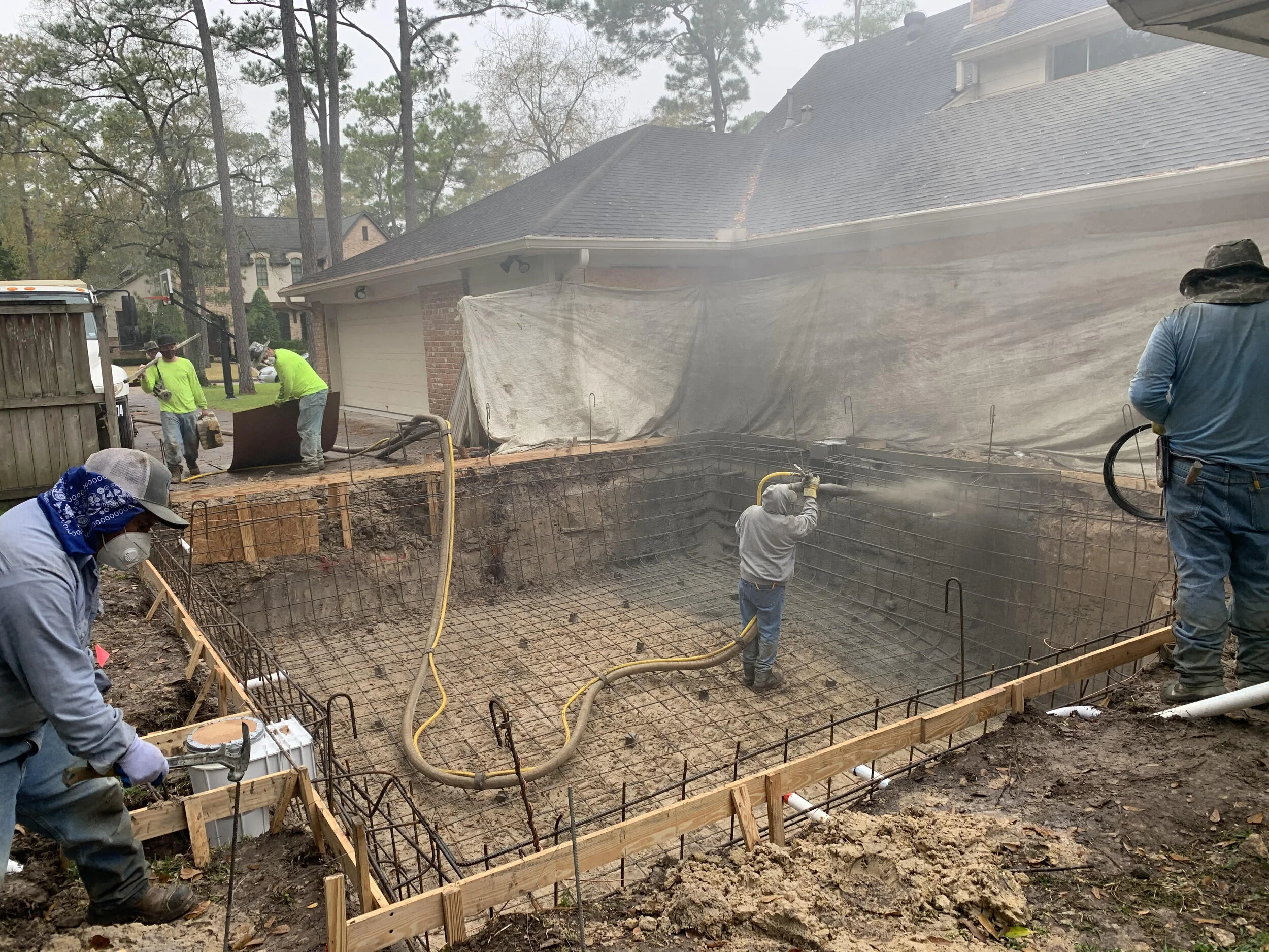
Below is a photo while the crew is spraying gunite.

The finished backyard. We removed the concrete patio and installed a swimming pool. The clients wanted an outdoor TV that was viewable while manning the grill and also while standing in the pool. Therefore, we custom built a covered patio with a wall to mount the TV, as well as provide a space for covered seating.

photo3.jpg

There are bar stools and benches built in the pool for this family and their guests to relax, enjoy a beverage, and cool off in the pool.

photo4.jpg

The grilling station and outdoor island.

photo5.jpg

A unique feature of this outdoor island is that we carried the beautiful white countertop down the sides and front.

photo6.jpg

A Modern Pool

For anyone who has designed their own swimming pool, you know there are so many decisions to make. In this custom pool in Bunker Hill Village we maxed out the lot coverage with the footprint being a modern rectangular shape. Below is a photo of the backyard before the pool installation.

photo3.jpg

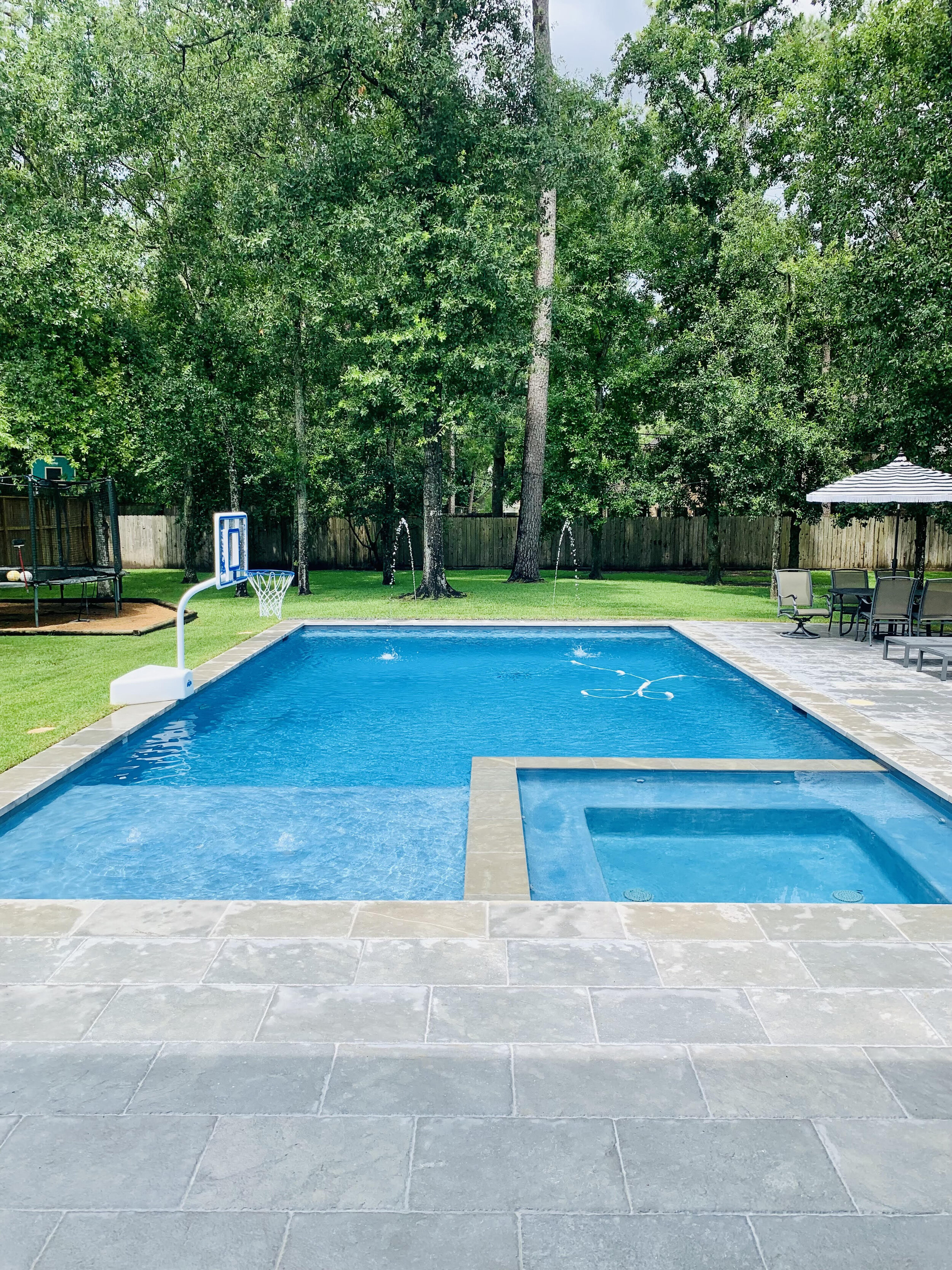
Here is a photo of the finished pool. When designing a custom pool with a spa, our vision is a clean and functional approach. Within the rectangular pool is a sun deck and an infinity edge spa with a bench on all four sides.

photo2.jpg

You will see that the two walls between the pool and spa are evenly lowered to allow water spillover and to let guests easily access the spa from inside the pool.

Picture Perfect Home in Bunker Hill

Ly Custom Homes is proud to feature this new construction in Bunker Hill Village. We broke ground in February 2020 and despite the COVID-19 pandemic and Winter Storm Uri, we were able to finish construction and allow the clients to move into their new home in February 2021.

Fortunately, the pandemic did not delay the construction too much because the clients and their designer Hallie Henley made most of the design decisions on the front end of the schedule. Once construction began, we kept the clients on a schedule so that we could order materials two to three months in advance. Even though many show rooms were closed, the design team was able to use their imagination so that all of the elements of the home flowed together and fit to scale. This collaborative effort led to this Picture Perfect Home.

Much praise has to go to the vision of Hallie Henley Design, who brought the unique design and point of view for the home’s interior. As you can see below, every room has a different experience from the wall color, trim, and lighting. It was a pleasure to be able to execute this vision.

Front Exterior -  The front view of this home is perfectly balanced and symmetrical with a simple and elegant look.

Front Exterior - The front view of this home is perfectly balanced and symmetrical with a simple and elegant look.

The Entry - With the large glass double doors from Cantera Doors, custom iron handrail, and custom wall paneling, this entrance is stunning.

The Entry - With the large glass double doors from Cantera Doors, custom iron handrail, and custom wall paneling, this entrance is stunning.

The Entry - Contemporary staircase highlighted by three sconces that are perfectly centered inside of three square wall panels.

The Entry - Contemporary staircase highlighted by three sconces that are perfectly centered inside of three square wall panels.

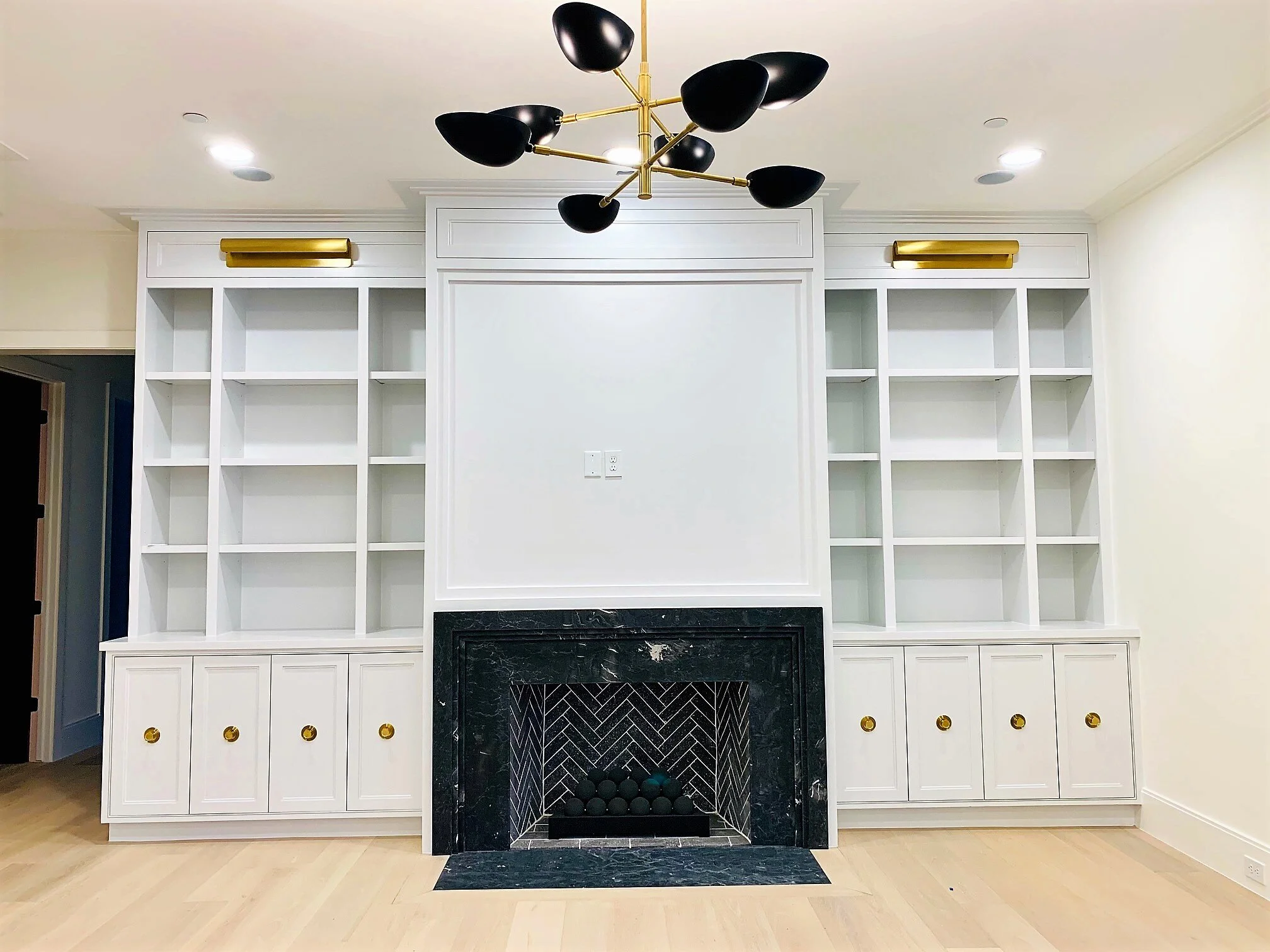
Great Room - My favorite part of this room is the herringbone fireplace with the Nero Marquina leather textured surround and hearth.

Great Room - My favorite part of this room is the herringbone fireplace with the Nero Marquina leather textured surround and hearth.

Kitchen - This kitchen design is light and fresh with custom made two tier shaker cabinets.

Kitchen - This kitchen design is light and fresh with custom made two tier shaker cabinets.

Kitchen - Even the refrigerator was custom designed for this family. The stainless steel Sub Zero fridge is 60 inches wide. The family chose to use 5 out of the 6 compartments for refrigeration and only one for the freezer, which caters to this fami…

Kitchen - Even the refrigerator was custom designed for this family. The stainless steel Sub Zero fridge is 60 inches wide. The family chose to use 5 out of the 6 compartments for refrigeration and only one for the freezer, which caters to this family’s needs.

Kitchen - The client selected this handcrafted tile for the backsplash. Since these tiles are handmade, no two are the exact same shape. When the tiles are placed together it gives the kitchen a texture that balances nicely against the clean straigh…

Kitchen - The client selected this handcrafted tile for the backsplash. Since these tiles are handmade, no two are the exact same shape. When the tiles are placed together it gives the kitchen a texture that balances nicely against the clean straight lines of the cabinetry. The tiles came in this pale blue shade. To create the cabinet color, we color matched the hue and then cut the intensity to 12.5% to add a little bit of contrast.

Open Concept - The kitchen, breakfast area, and great room all in one space.

Open Concept - The kitchen, breakfast area, and great room all in one space.

Breakfast Area - This breakfast area contains built-ins for additional storage and a custom made marble shelf with brass brackets with a marble backsplash.

Breakfast Area - This breakfast area contains built-ins for additional storage and a custom made marble shelf with brass brackets with a marble backsplash.

Dining Room - The blush paint on the walls and blush colored trim finished in a high-gloss create a chic look for this dining room, topped off with an ornate light fixture.

Dining Room - The blush paint on the walls and blush colored trim finished in a high-gloss create a chic look for this dining room, topped off with an ornate light fixture.

Home Office - This side of the home office is designated for a sofa and television.

Home Office - This side of the home office is designated for a sofa and television.

Home Office - The opposite side of the home office contains a space for wall art / diplomas.

Home Office - The opposite side of the home office contains a space for wall art / diplomas.

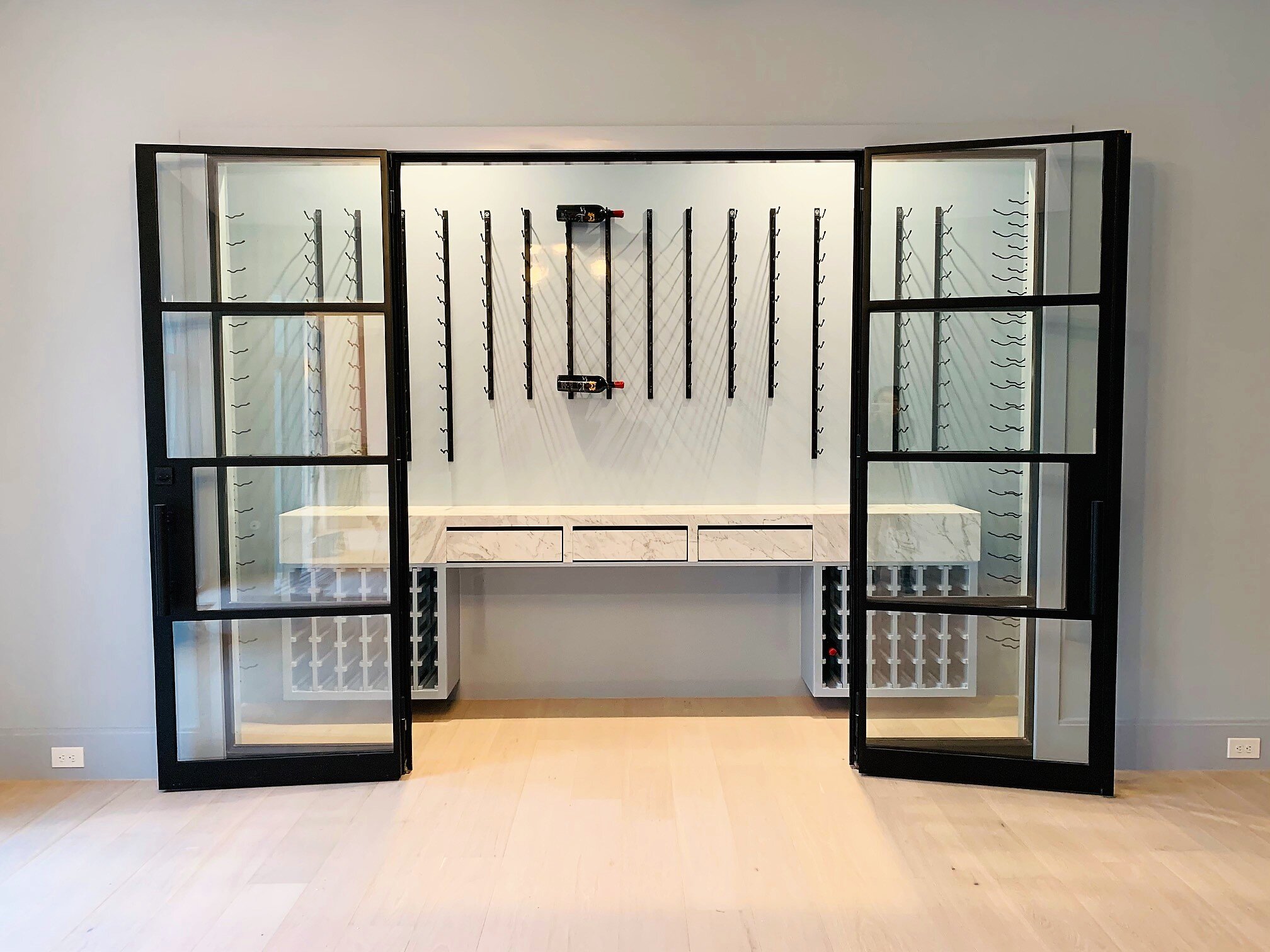
Wine Room - This home has an entire front room designated as a space to enjoy wine with friends. This walk-in chilled wine cellar is the showcase of the room and will display the family’s extensive wine collection from around the world. Much thought…

Wine Room - This home has an entire front room designated as a space to enjoy wine with friends. This walk-in chilled wine cellar is the showcase of the room and will display the family’s extensive wine collection from around the world. Much thought and intention went into designing the metal wine racks. We wanted to maximize the space but also allow them to display their wine collection in an aesthetically pleasing way.

The Bar  - We love the juxtaposition of the high gloss black cabinets and the Nero Marquina honed marble countertop.

The Bar - We love the juxtaposition of the high gloss black cabinets and the Nero Marquina honed marble countertop.

Mud Room - The lockers are painted in a fun blue and the mesh inserts that were painted in the matching blue color provide privacy and style.

Mud Room - The lockers are painted in a fun blue and the mesh inserts that were painted in the matching blue color provide privacy and style.

Game Room - The blue painted cabinets add a pop of color in this game room.

Game Room - The blue painted cabinets add a pop of color in this game room.

Master Bedroom

Master Bedroom

Master Bath - Lots of fun design going on in this master bathroom.

Master Bath - Lots of fun design going on in this master bathroom.

Master Bath

Master Bath

Master Bath

Master Bath

Guest Bath - Even using simple neutral colors can create a beautiful bathroom vanity.

Guest Bath - Even using simple neutral colors can create a beautiful bathroom vanity.

Boy’s Bath - Even the kids got to make some design decisions.

Boy’s Bath - Even the kids got to make some design decisions.

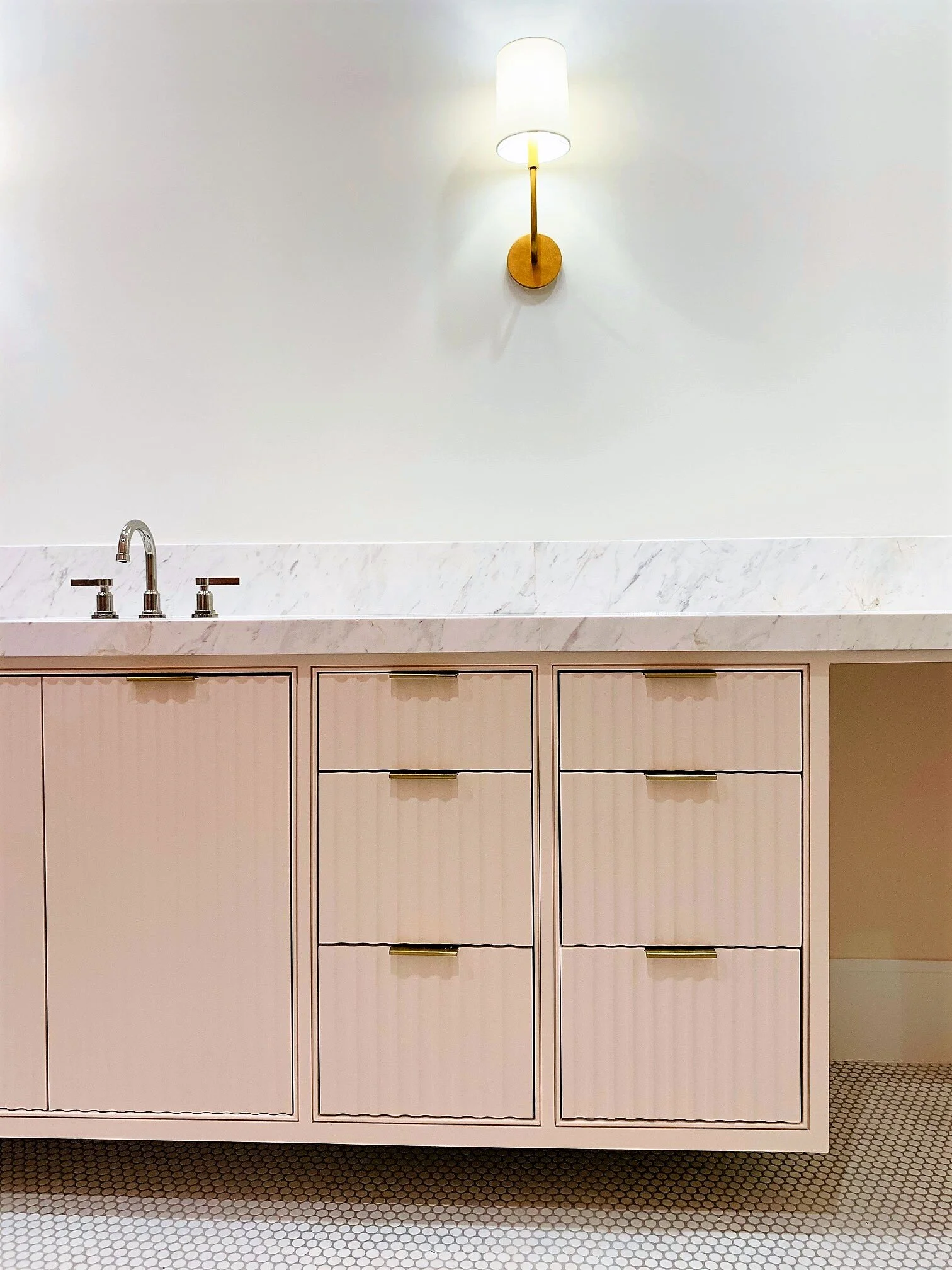
Girl’s Bath - It was fun building this girl’s dream bathroom.

Girl’s Bath - It was fun building this girl’s dream bathroom.

Girl’s Bath

Girl’s Bath

Girl’s Bath

Girl’s Bath

Before and After of a Wilchester Remodel

Since LY Custom Homes primarily builds homes in the Memorial Area of Houston, the question we get asked often from potential clients is whether they should remodel or tear down. Specifically, there are an influx of remodels/new constructions in the Memorial West area, which is the Memorial area west of the Beltway 8. This area was first developed in the 1960s when there was a rapid growth westwards of the Houston metropolitan area. This lead to the development of subdivisions in the Memorial West area, including Wilchester, Nottingham Forest, Westchester and Memorial Bend. These residential areas are especially charming because each home is uniquely styled. Some examples of the home styles are Traditional, Craftsman, Colonial, Georgian, French, Southern Traditional, Cottage style, English, and the list goes on.

Currently, the Memorial West area is still a desirable area for families due to the tall trees, close-knit communities, highly rated schools, and proximity to the Energy Corridor, as well as inside the loop. But, these charming homes are now over half-a-century old. Thus, a family moving into one of these original 1960s homes must invest a great deal of money to update the house. At the very minimum, one will need to update the plumbing, electrical, and mechanical for an older home. While the home is being opened up for these major component changes, it is a perfect time to make cosmetic changes as well.

To answer the question as to whether to remodel or tear down depends on the clients’ budget and expectations for their new home. Recall that in early 2020, Ly Custom Homes finished a new build in Memorial West where the clients decided to tear down the existing home. In the latter half of 2020, another client decided to go the other route and gut/remodel their Wilchester home. Below are the “Before” and “After” photos of this major remodel. Demolition started in February 2020 and despite the pandemic, the family moved into their newly remodeled home by October 2020, just in time for the holidays.

Front Exterior - Before.

Front Exterior - Before.

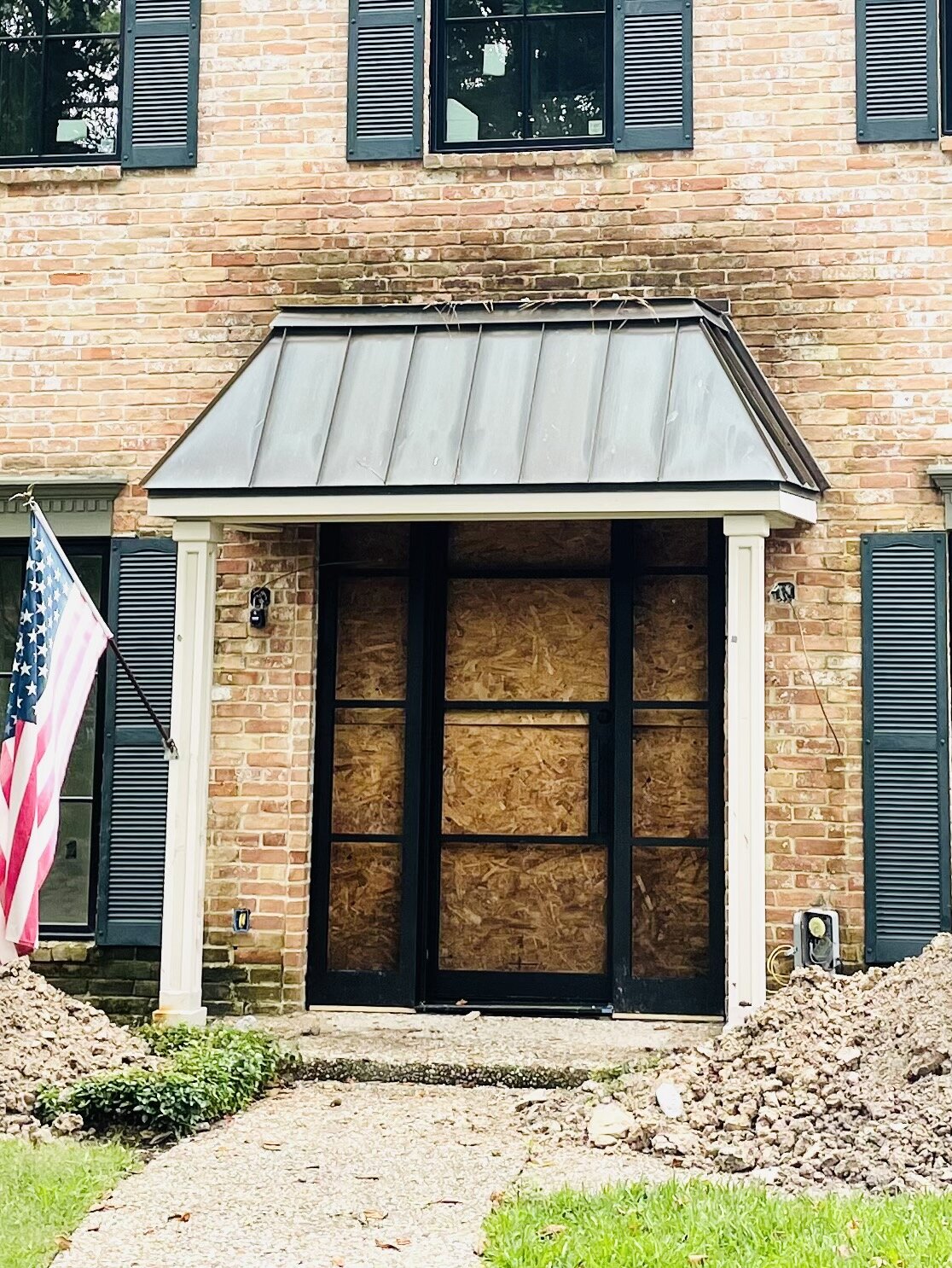
Front Exterior - After.  We added a white mortar fill to brighten up the brick, installed new windows and front door, and brightened up the walkway to the home.

Front Exterior - After. We added a white mortar fill to brighten up the brick, installed new windows and front door, and brightened up the walkway to the home.

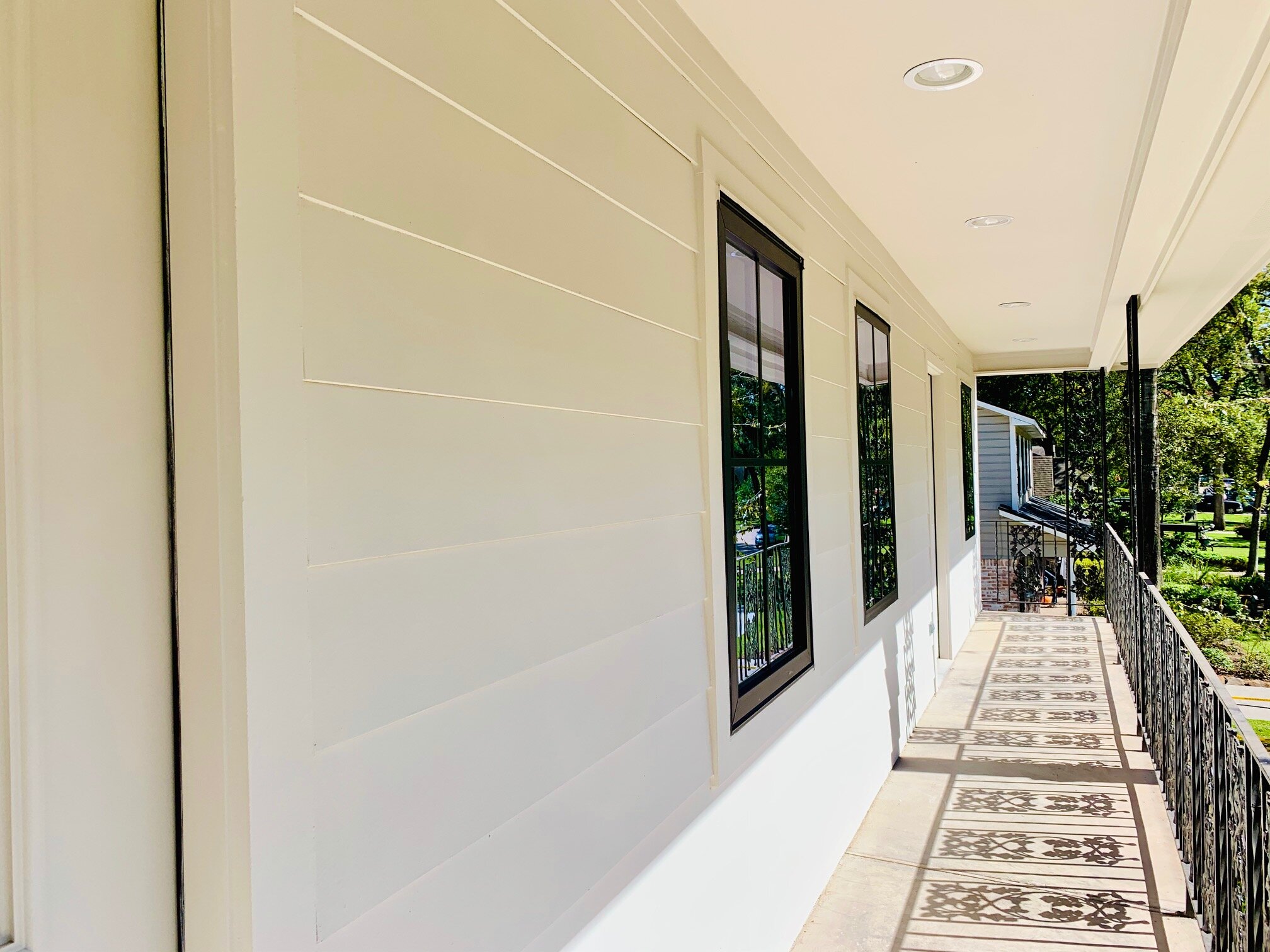
Front Exterior - After.  We replaced the wood siding that had rotted over the years with a more durable hardy plank siding, along with fresh coat of white paint.

Front Exterior - After. We replaced the wood siding that had rotted over the years with a more durable hardy plank siding, along with fresh coat of white paint.

Backyard - Before. The back side of the home was flat with no covered area for seating.

Backyard - Before. The back side of the home was flat with no covered area for seating.

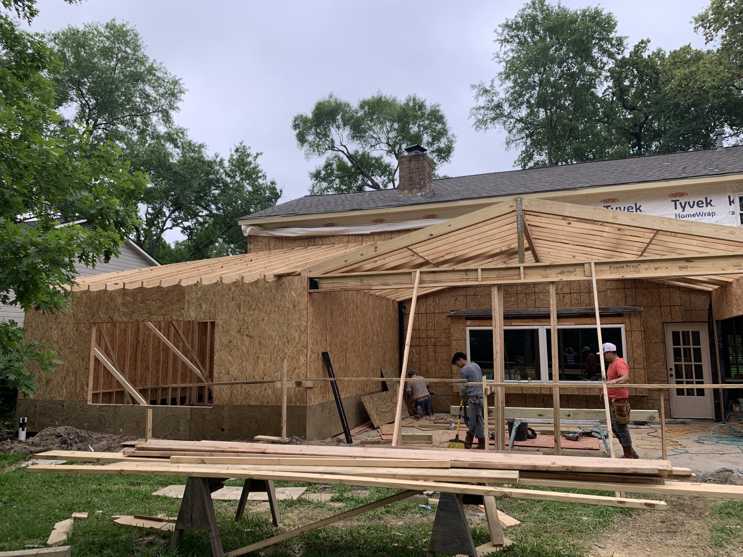
Backyard- In Construction. We built an extension to the home, to accommodate for a master wing with a full-size bathroom, bedroom, and walk-in closet. We also built a covered patio for a great outdoor living space.

Backyard- In Construction. We built an extension to the home, to accommodate for a master wing with a full-size bathroom, bedroom, and walk-in closet. We also built a covered patio for a great outdoor living space.

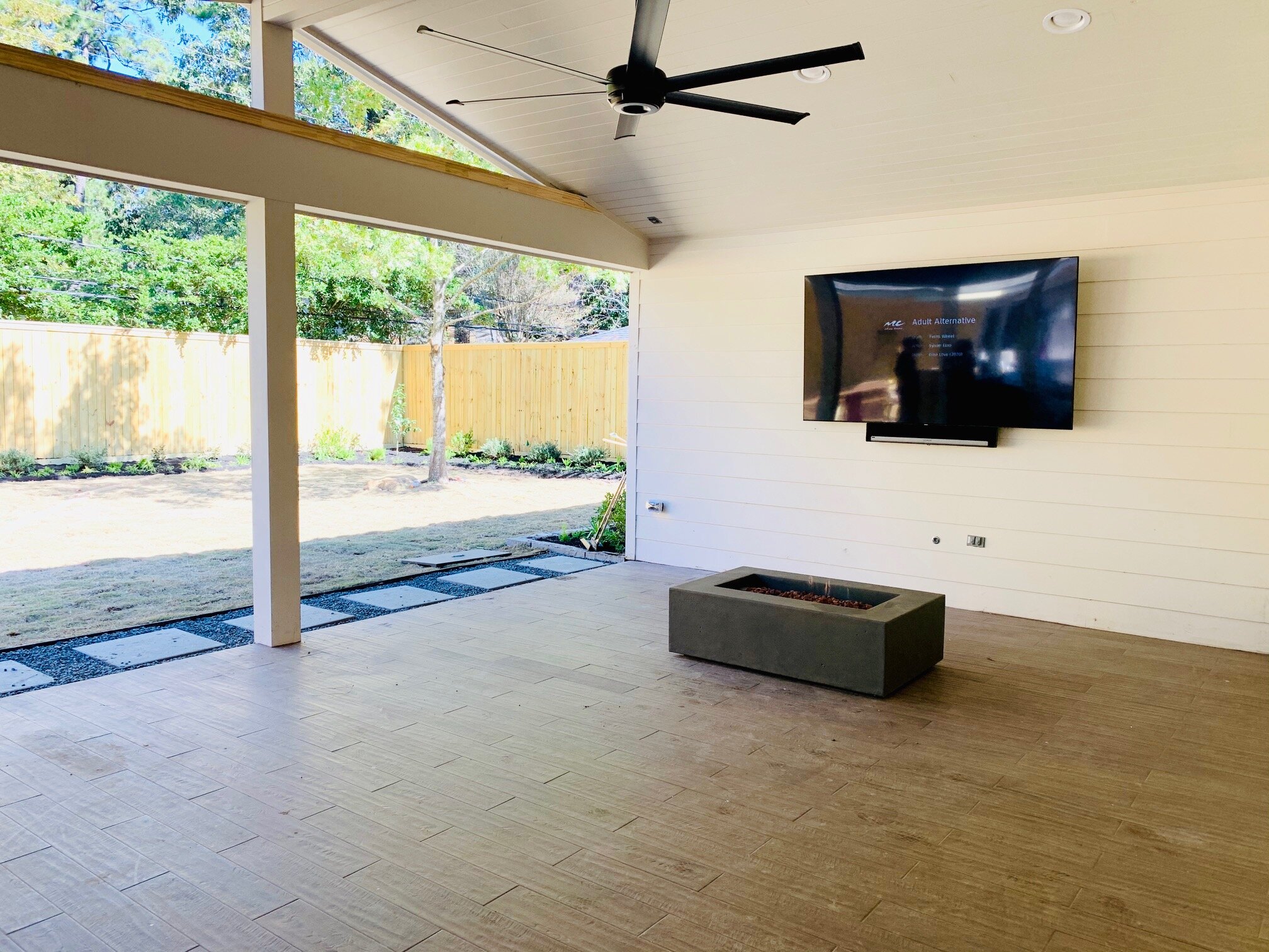
Backyard - After. Now the family has a cozy space to relax outdoors and entertain guests. In the Texas summers, the #BigAssFan will help circulate the air.

Backyard - After. Now the family has a cozy space to relax outdoors and entertain guests. In the Texas summers, the #BigAssFan will help circulate the air.

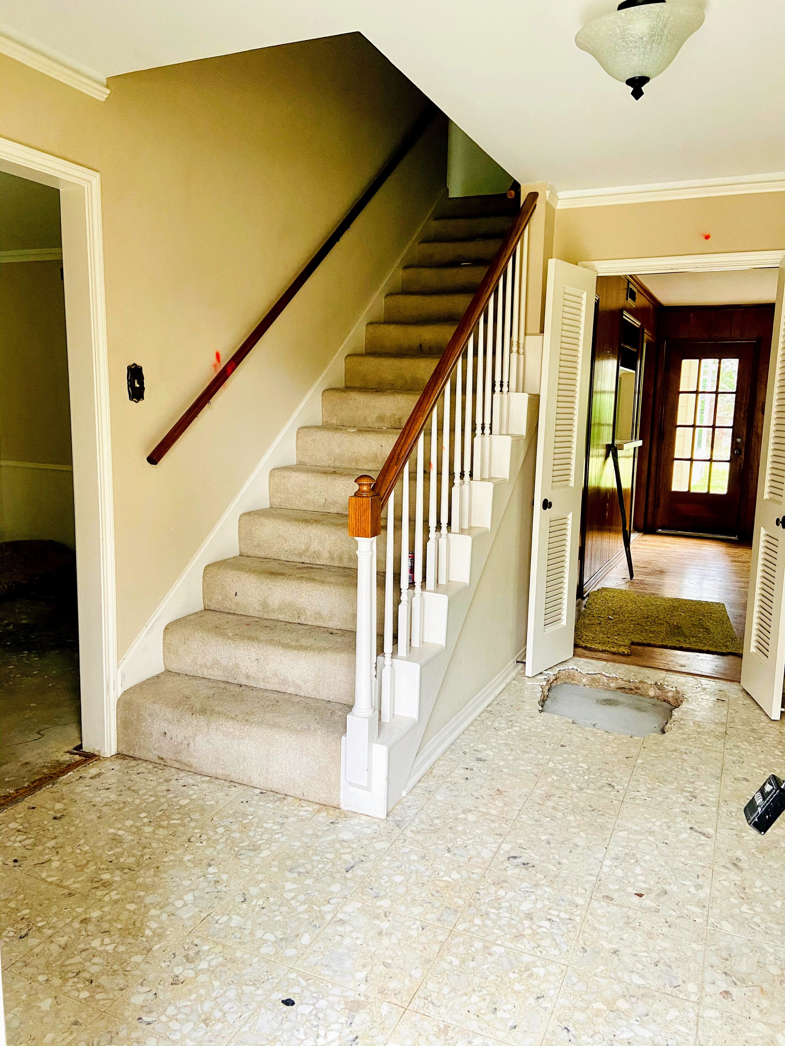
The Entry - Before.

The Entry - Before.

The Entry - After. We installed wood tile on top of the existing terrazzo and swapped out the railing for a metal modern look.

The Entry - After. We installed wood tile on top of the existing terrazzo and swapped out the railing for a metal modern look.

The Entry - After.

The Entry - After.

Great Room - Before.

Great Room - Before.

Great Room - After. Goodbye wood paneling! We made the fireplace taller by removing the raised hearth. We also removed the awkward brick extension of the fireplace, which allowed for more cabinet storage space.

Great Room - After. Goodbye wood paneling! We made the fireplace taller by removing the raised hearth. We also removed the awkward brick extension of the fireplace, which allowed for more cabinet storage space.

Kitchen - Before. This kitchen was ready for a makeover.

Kitchen - Before. This kitchen was ready for a makeover.

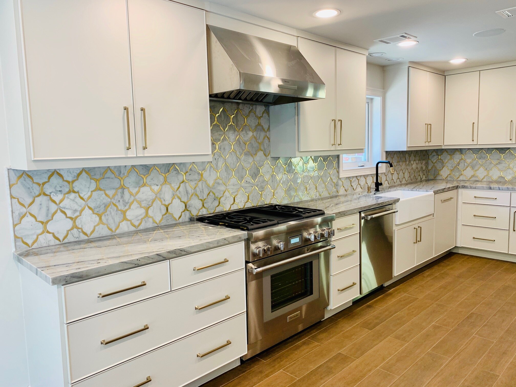
Kitchen - After. The highlight of this beautiful kitchen is definitely the made-to-order backsplash, which uses a combination of gold accent metal and Carrara marble.

Kitchen - After. The highlight of this beautiful kitchen is definitely the made-to-order backsplash, which uses a combination of gold accent metal and Carrara marble.

Bar Area - Before.

Bar Area - Before.

Bar Area - After. The homeowner had purchased these antique cabinet doors years ago and was thrilled to showcase them in her entertainment area.

Bar Area - After. The homeowner had purchased these antique cabinet doors years ago and was thrilled to showcase them in her entertainment area.

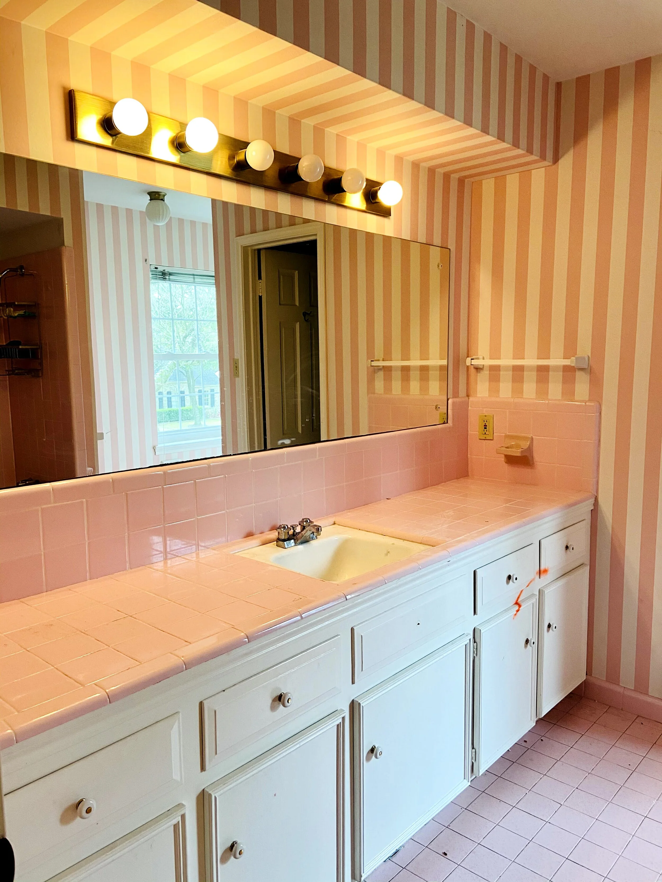
Secondary Bathroom - Before.

Secondary Bathroom - Before.

Secondary Bathroom - After.

Secondary Bathroom - After.

Secondary Bathroom Shower - Before.

Secondary Bathroom Shower - Before.

Secondary Bathroom Shower - After.

Secondary Bathroom Shower - After.

Vanity - Before. Like many homes built circa 1960s, there is a vanity in bedroom. This was convenient for their daughter’s room, so we kept it and gave the vanity a makeover, as you can see below.

Vanity - Before. Like many homes built circa 1960s, there is a vanity in bedroom. This was convenient for their daughter’s room, so we kept it and gave the vanity a makeover, as you can see below.

Vanity - After.

Vanity - After.

Utility Room - After.

Utility Room - After.

Master Bath - After.

Master Bath - After.
Powder Bath - After.  This powder bath with the colorful wallpaper and gold fixtures is simply stunning.
Powder Bath - After. This powder bath with the colorful wallpaper and gold fixtures is simply stunning.
New Year, New Backyard

Happy New Year! For those who are staying safe and quarantining, an outdoor living space is key. After just a few weeks into the pandemic, LY Custom Homes worked on this renovation of a backyard in Bunker Hill Village. The renovation consisted of upgrading the swimming pool, building a large wooden deck, and constructing a spacious covered patio. Now these clients have a beautiful space to dine outside and invite friends over for a cocktail on the patio, all in the comfort of their own home.

1-Overall.jpg
3-roof.jpg
4-living.jpg

The Modern Farmhouse

After 10 months in construction, the Blank Canvas is complete. This was a home that was 100% designed by Ly Custom Homes. The home design was focused on a refreshed take on classic elements. Throughout the home in the interior and exterior, you will see the color palette of black, white, and natural wood mixed with the natural brick stone. If we had to give a name to this home’s style, we would call it The Modern Farmhouse.

Exterior of the Home - The exterior is a combination of brick, lap siding, and board-and-batt siding. Additionally, there are dormers and gables that give the home a traditional feel. Lastly, the #SierraPacific windows are designed with thin simulat…

Exterior of the Home - The exterior is a combination of brick, lap siding, and board-and-batt siding. Additionally, there are dormers and gables that give the home a traditional feel. Lastly, the #SierraPacific windows are designed with thin simulated divided lites to give it a clean look.

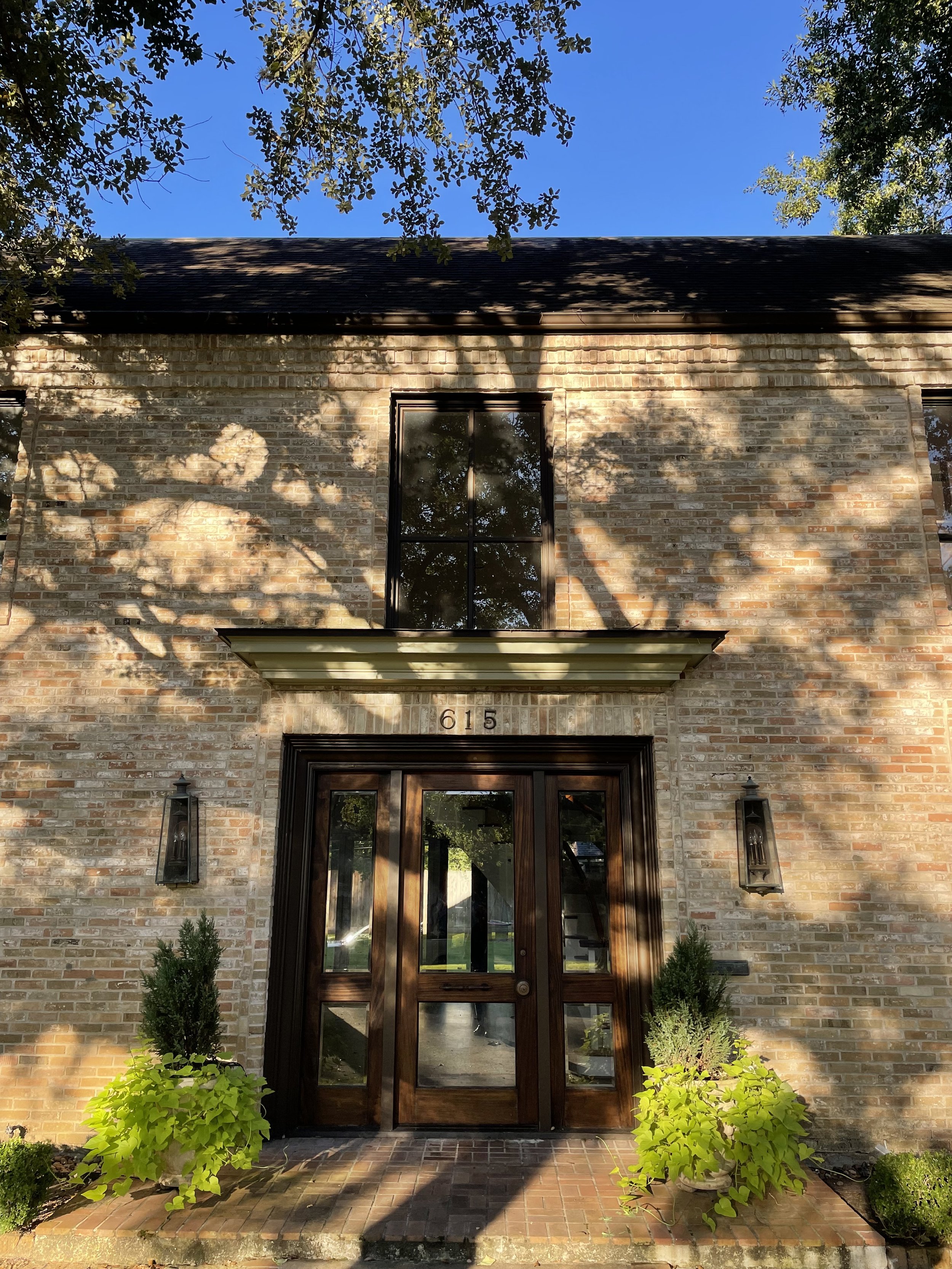
Front Door - The front double door is a three-quarter lite with one panel to allow natural light to shine through in the house. There is a herringbone brick designed landing. The brick used on the front porch was repurposed from the original home.

Front Door - The front double door is a three-quarter lite with one panel to allow natural light to shine through in the house. There is a herringbone brick designed landing. The brick used on the front porch was repurposed from the original home.

The Foyer - In the foyer, there is a two story custom made wall paneling surrounding an elegant and sleek gold gilded chandelier from #RestorationHardware. The shape and size of the paneling in the foyer compliments the paneling on the interior door…

The Foyer - In the foyer, there is a two story custom made wall paneling surrounding an elegant and sleek gold gilded chandelier from #RestorationHardware. The shape and size of the paneling in the foyer compliments the paneling on the interior doors.

The Office - Immediately when you enter the home is the office. The office doors match the style of the front door in that they are three-quarter lite one panel French doors. We used these French antique #Emtek doorknobs because they had a narrow an…

The Office - Immediately when you enter the home is the office. The office doors match the style of the front door in that they are three-quarter lite one panel French doors. We used these French antique #Emtek doorknobs because they had a narrow and tall back plate that gives the doors a more bold look. We used a custom stain color on the office doors that also matches the tabletop in the office. We used custom top-down-bottom-up shades from #TheShadeShop for the large windows.

The Home Office Desk and Built-Ins - With COVID precautions resulting in people working at home, a comfortable and functional home office is more important than ever. This home office also serves as the craft room, and thus the custom built-ins on t…

The Home Office Desk and Built-Ins - With COVID precautions resulting in people working at home, a comfortable and functional home office is more important than ever. This home office also serves as the craft room, and thus the custom built-ins on the sides of the desk space allow for lots of hidden storage.
The Dining Room - The dining room has a 6 foot round table that was fabricated from the same marble used throughout the house.

The Dining Room - The dining room has a 6 foot round table that was fabricated from the same marble used throughout the house.

The Great Room - We kept the oversized fireplace from the original home (remember this?) and gave it a mortar wash. The windows in the great room overlook the backyard. In between the kitchen and great room is an adult beverage bar / drink station.

The Great Room - We kept the oversized fireplace from the original home (remember this?) and gave it a mortar wash. The windows in the great room overlook the backyard. In between the kitchen and great room is an adult beverage bar / drink station.

The Kitchen - The focal point of the kitchen is counter-to-ceiling marble backsplash. It took two slabs (book-matched) to create the look. The intention behind the design of the vent hood was so that it could serve as a design element, along with be…

The Kitchen - The focal point of the kitchen is counter-to-ceiling marble backsplash. It took two slabs (book-matched) to create the look. The intention behind the design of the vent hood was so that it could serve as a design element, along with being used for its functional purpose. The pendant lights over the 8.5 foot island are from #Rejuvenation. There are two apron sinks servicing the kitchen with bridge style faucets from #NewportBrass.

The Powder Bath - The powder bath has a floating vanity with a tall apron, a wall faucet to achieve a more clean look for the countertop, and a beautifully designed wallpaper from #Anthropologie.

The Powder Bath - The powder bath has a floating vanity with a tall apron, a wall faucet to achieve a more clean look for the countertop, and a beautifully designed wallpaper from #Anthropologie.

The Upstairs Landing - The library paneling in the foyer continues up the stairs and into second floor.

The Upstairs Landing - The library paneling in the foyer continues up the stairs and into second floor.

The Master Bedroom - The Master Bedroom has a cathedral ceiling treatment accented with floating wood beams that were custom stained to match the hardwood floors.

The Master Bedroom - The Master Bedroom has a cathedral ceiling treatment accented with floating wood beams that were custom stained to match the hardwood floors.

The Master Bath - There are double doors that frame the entrance to the master bath. We carried the cathedral ceiling into the bathroom and it outlines the centerpiece of the room, which is the black cast iron clawfoot tub from #VintageTubAndBath. T…

The Master Bath - There are double doors that frame the entrance to the master bath. We carried the cathedral ceiling into the bathroom and it outlines the centerpiece of the room, which is the black cast iron clawfoot tub from #VintageTubAndBath. The black painted interior doors also provide a nice contrast to the white marble floor, countertop, and shower tiles.

The Master Closet

The Master Closet

The Kids’ Bedroom - We built a custom bunk bed room, allowing for two twin beds on top, a queen on the bottom, and a lounge area.

The Kids’ Bedroom - We built a custom bunk bed room, allowing for two twin beds on top, a queen on the bottom, and a lounge area.

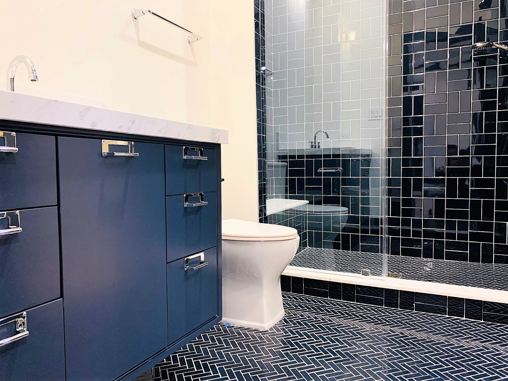
The Kids’ Bathroom - We used #PoloBlue paint from #BenjaminMoore on the cabinets and used classic subway tiles to create a fun look for the shower.
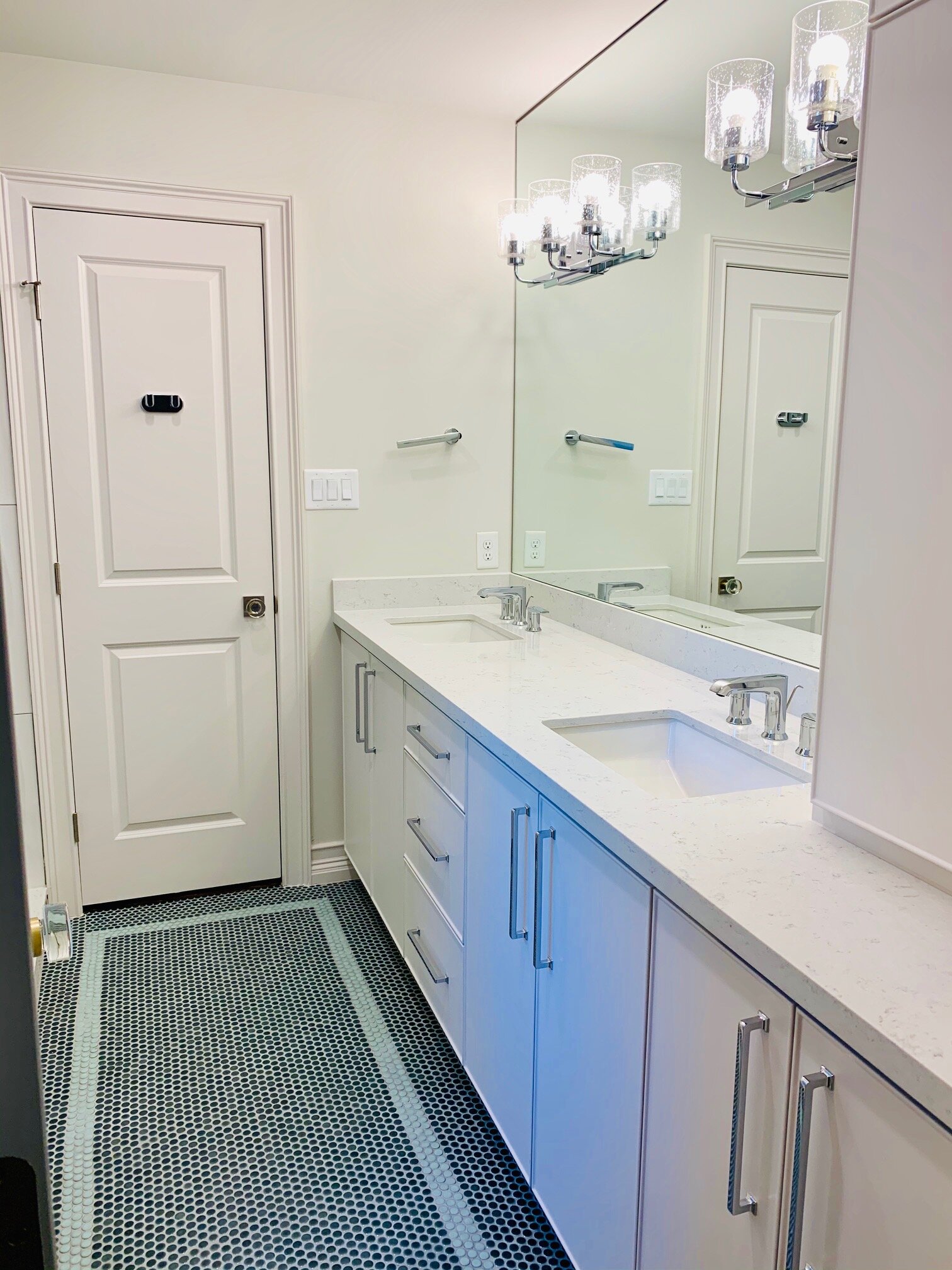
The Kids’ Bathroom - We used #PoloBlue paint from #BenjaminMoore on the cabinets and used classic subway tiles to create a fun look for the shower.

The Kids’ Shower - Here is a closer view of the shower. We used #CobaltBlue subway tiles on the walls and penny rounds for the floor.

The Kids’ Shower - Here is a closer view of the shower. We used #CobaltBlue subway tiles on the walls and penny rounds for the floor.

The Mud Room - The room most traveled through everyday will be this mud room.

The Mud Room - The room most traveled through everyday will be this mud room.

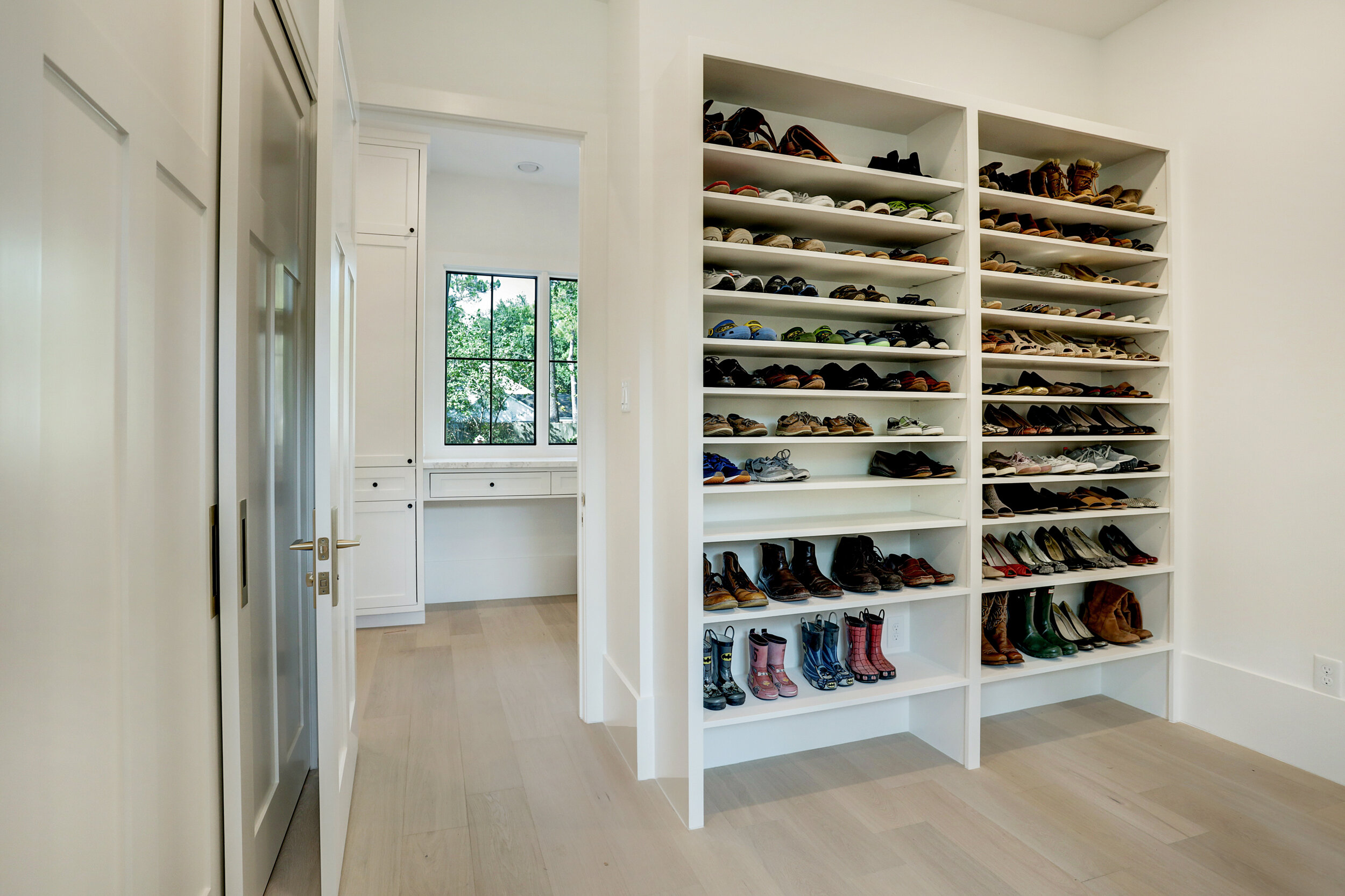
Flex Room - Behind the mud room is a flex room which provides additional storage space and holds the whole families’ shoes and coats.

Flex Room - Behind the mud room is a flex room which provides additional storage space and holds the whole families’ shoes and coats.

Tree Shopping

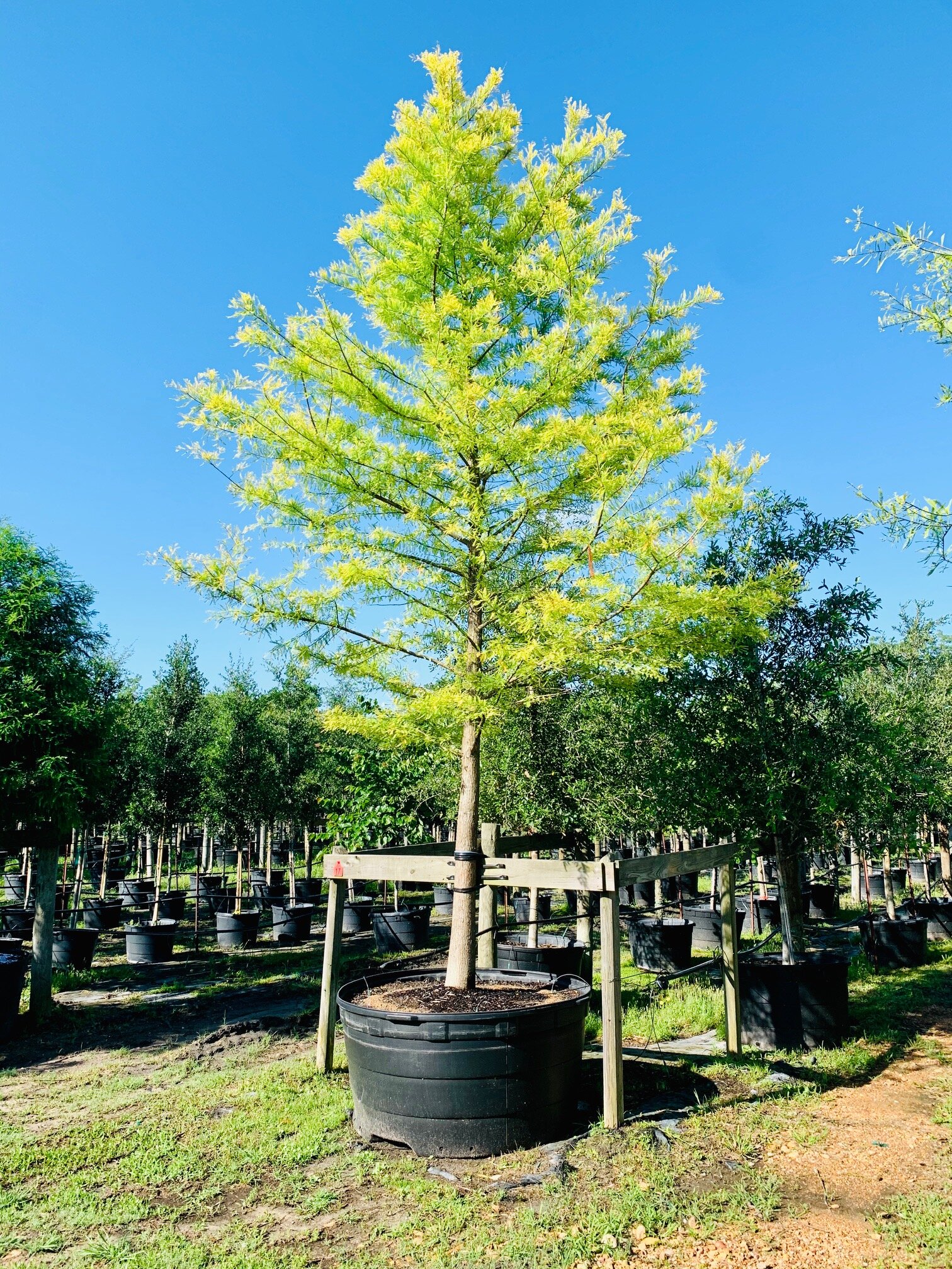
For one of our new construction projects in the Memorial Villages we had to remove several mature trees during the demo process. The original plan was to remove 5 trees that were interfering with the new foundation. Then, after deciding to place over head electric and communication power lines in an underground easement (a decision that provided great benefit since it prevented the eyesore of power lines in the backyard and also allowed for the pool to be placed in an ideal position without having to worrying about hanging power lines), we decided to clear an additional 5 trees that blocked the pathway for CenterPoint to install those underground lines.

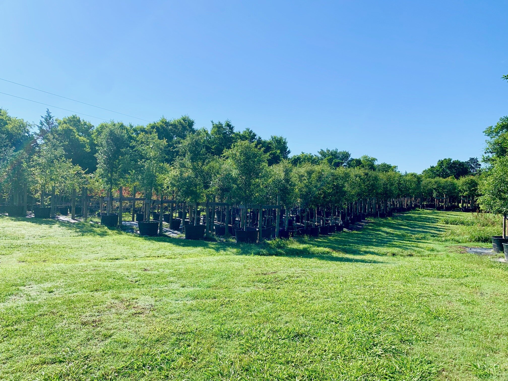
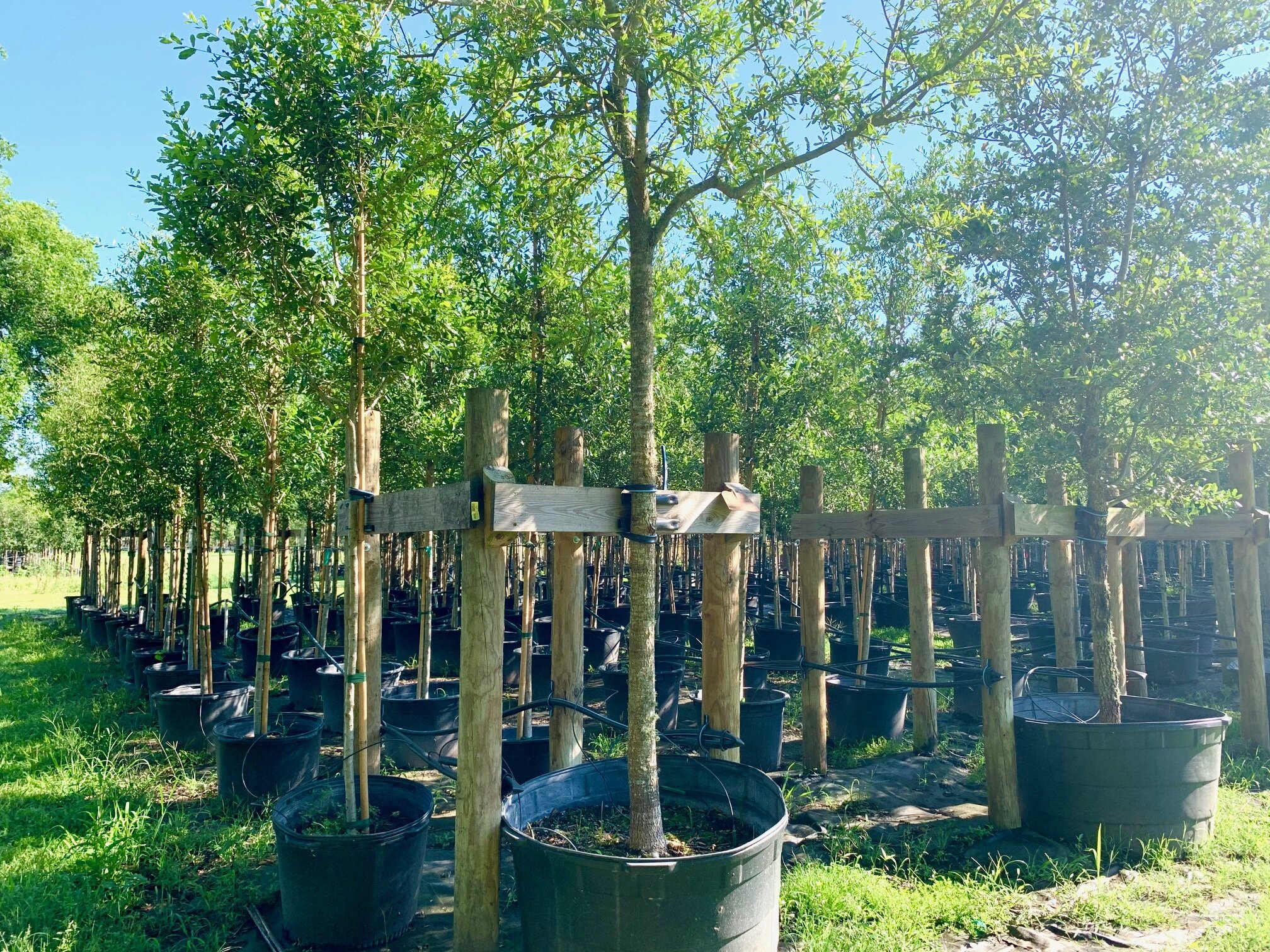
The local tree preservation ordinance generally requires that for every one mature tree removed, there must be two replanted. There are also requirements for the size of these replacement trees. For this project, we had to purchase and plant 20 trees that were 95 gallons each. This could have easily tripled the clients’ budget for trees. We researched for local tree farms in the region and found a well-established Tree Farm in Brenham, Texas with very reasonable prices. Before making such a large purchase, I wanted to personally see the inventory and decide on the type of tree to compliment the style and design of the home. Thus, I brought the family (who were eager to take a pause from quarantine life on this beautiful morning) and we visited the tree nursery. After getting a tour of the farm, 20 trees (types include Crape Myrtle, Bald Cypress, and Caroline Sapphire Arizona Cypress) have been purchased and scheduled for delivery before Christmas, when the construction will be in the landscaping phase.

Three months in Three photos

This post will highlight the next stage of this new construction. After creating the Blank Canvas and Raising the Foundation, it was time to start building the actual house.

IMG_1714.jpg

One of the first things we had to do was install a steel beam to support a wide opening between the great room and family room.

The next three photos show the progress of construction for the next three months.

IMG_1787.jpg

One week into framing.

IMG_1837.jpg

Two weeks later, framing is complete and you can start to see the shape of the house.

IMG_2410.jpg

Two months later, the house is “dried-in”, meaning the exterior sheathing, roof, and windows are in place. As you can see, we’ve already started installing the brick and siding, which will ultimately cover the exterior of the house. More to come…

French Country Home In Memorial West

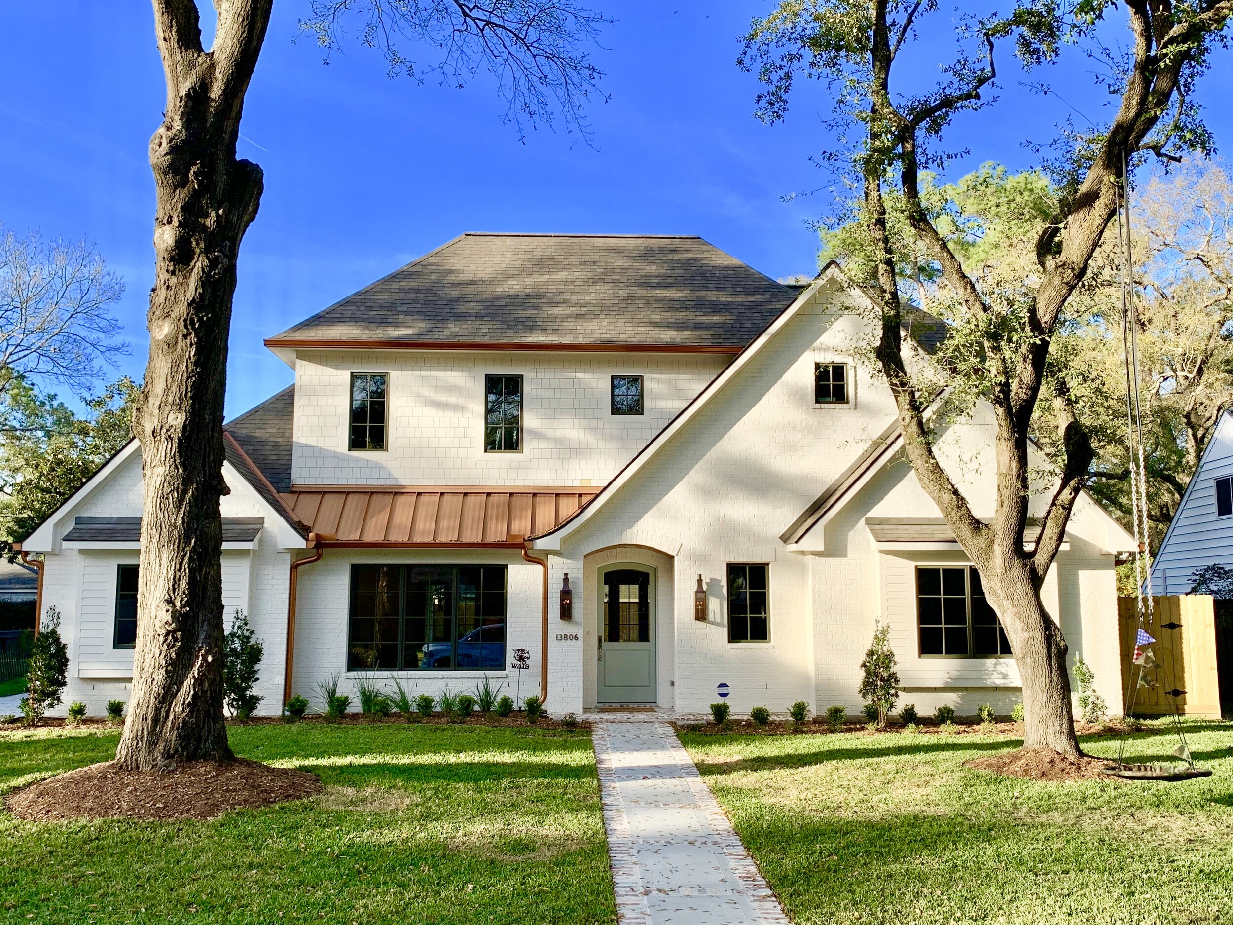
I had the opportunity to custom build a new house in the Memorial West area of Houston. The client was a realtor who had spent years admiring and critiquing homes to buy and sell. Throughout this experience she had developed her own unique and creative sense of design. She selected finishes that were in line with the trends but more importantly contained elements that she truly loved. She went bold on her design decisions and in the end, created a beautiful statement home for her family to enjoy.

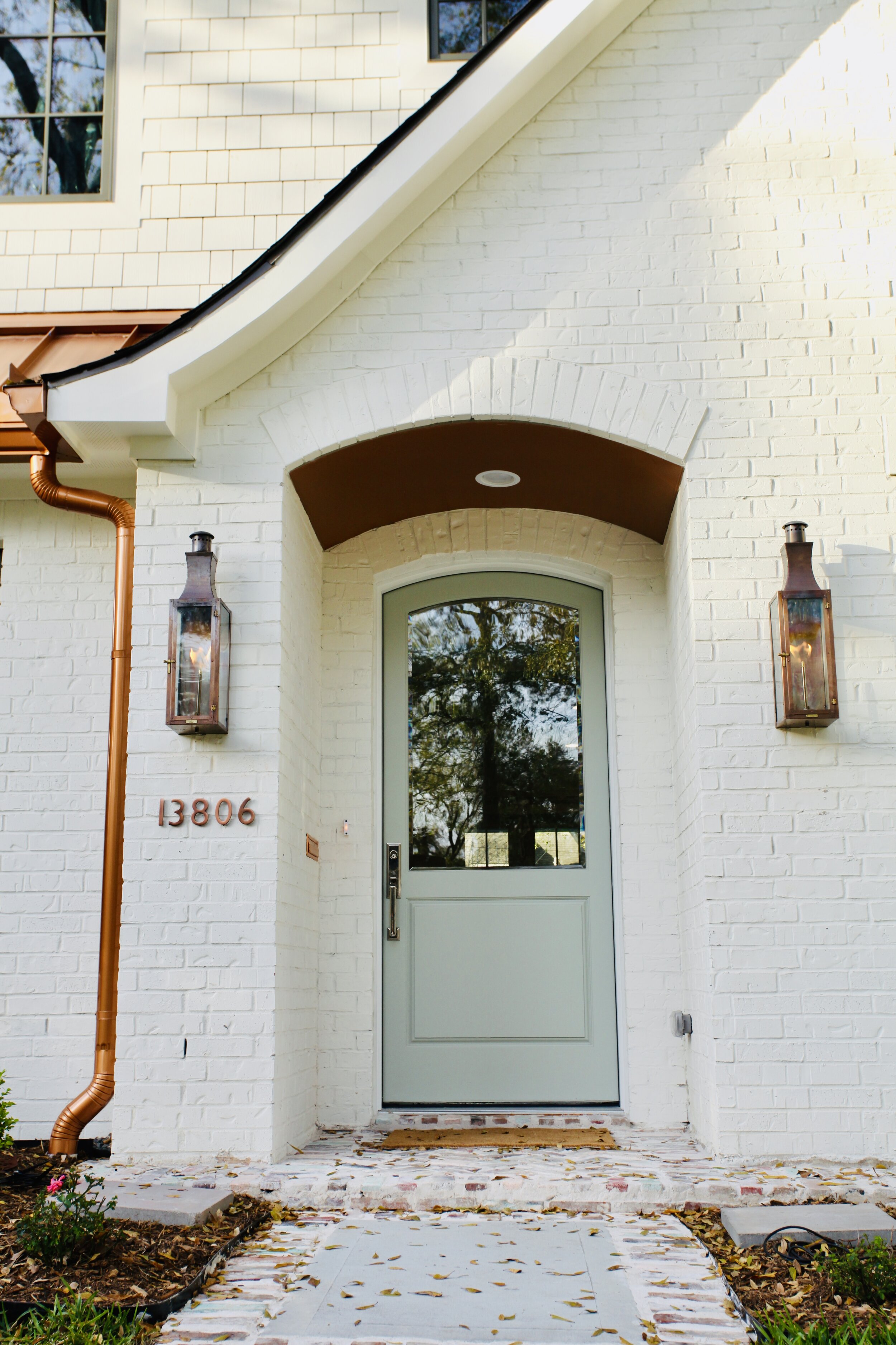
Starting with the exterior, the shaker shingles were inspired by the Cape Cod Style. The copper roof, gas lanterns, brick pavers, and green front door were inspired by the New Orleans French Country homes. The cross gable (the largest triangle with …

Starting with the exterior, the shaker shingles were inspired by the Cape Cod Style. The copper roof, gas lanterns, brick pavers, and green front door were inspired by the New Orleans French Country homes. The cross gable (the largest triangle with the smaller triangle roof inside of it) is an architectural piece and also is meant to bring balance to the home. The client selected a warm white paint for the exterior to bring all the design together.

The subtle swoop in the gable above the front door adds a bit of charm to the home.

The subtle swoop in the gable above the front door adds a bit of charm to the home.

The client loves green and knew how to tastefully accent her home with her favorite color. She painted her front door light green. The large windows are green. Even the herringbone brick pattern on the landing from the curb has accent bricks that ar…

The client loves green and knew how to tastefully accent her home with her favorite color. She painted her front door light green. The large windows are green. Even the herringbone brick pattern on the landing from the curb has accent bricks that are painted green.

As you walk in the home, there is an open floor plan where the living, dining and kitchen are connected.

As you walk in the home, there is an open floor plan where the living, dining and kitchen are connected.

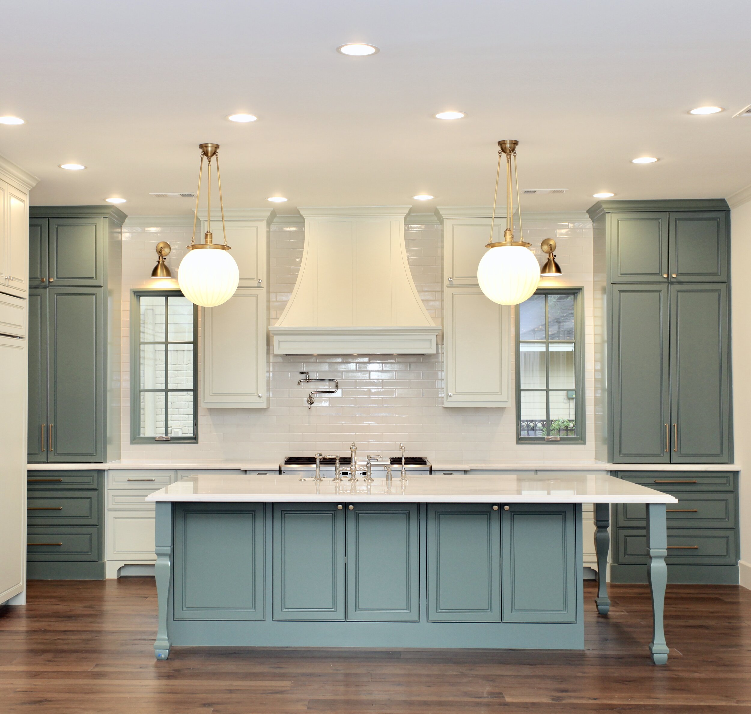
This French Country kitchen is painted in a two-toned green with gold and brass finishes. The outer cabinet towers are painted a darker shade of green to frame the kitchen. The elegant light fixtures are from #Rejuvenation. The sink faucet is from #…

This French Country kitchen is painted in a two-toned green with gold and brass finishes. The outer cabinet towers are painted a darker shade of green to frame the kitchen. The elegant light fixtures are from #Rejuvenation. The sink faucet is from #Rohl and compliments the gold lighting. The custom vent hood is curved and breaks up the straight lines to add a delicate feel to the kitchen.

Living room built-ins - The client purchased the tall cabinet doors on the right side from an antique shop and asked us to create custom built-ins to compliment the doors.

Living room built-ins - The client purchased the tall cabinet doors on the right side from an antique shop and asked us to create custom built-ins to compliment the doors.

As you can see, this home has an abundance of built-ins and hidden storage. This is the home office / man cave.

As you can see, this home has an abundance of built-ins and hidden storage. This is the home office / man cave.

Another view of the home office. We love the library lighting and the one-lite one-panel double door with glass knobs.

Another view of the home office. We love the library lighting and the one-lite one-panel double door with glass knobs.

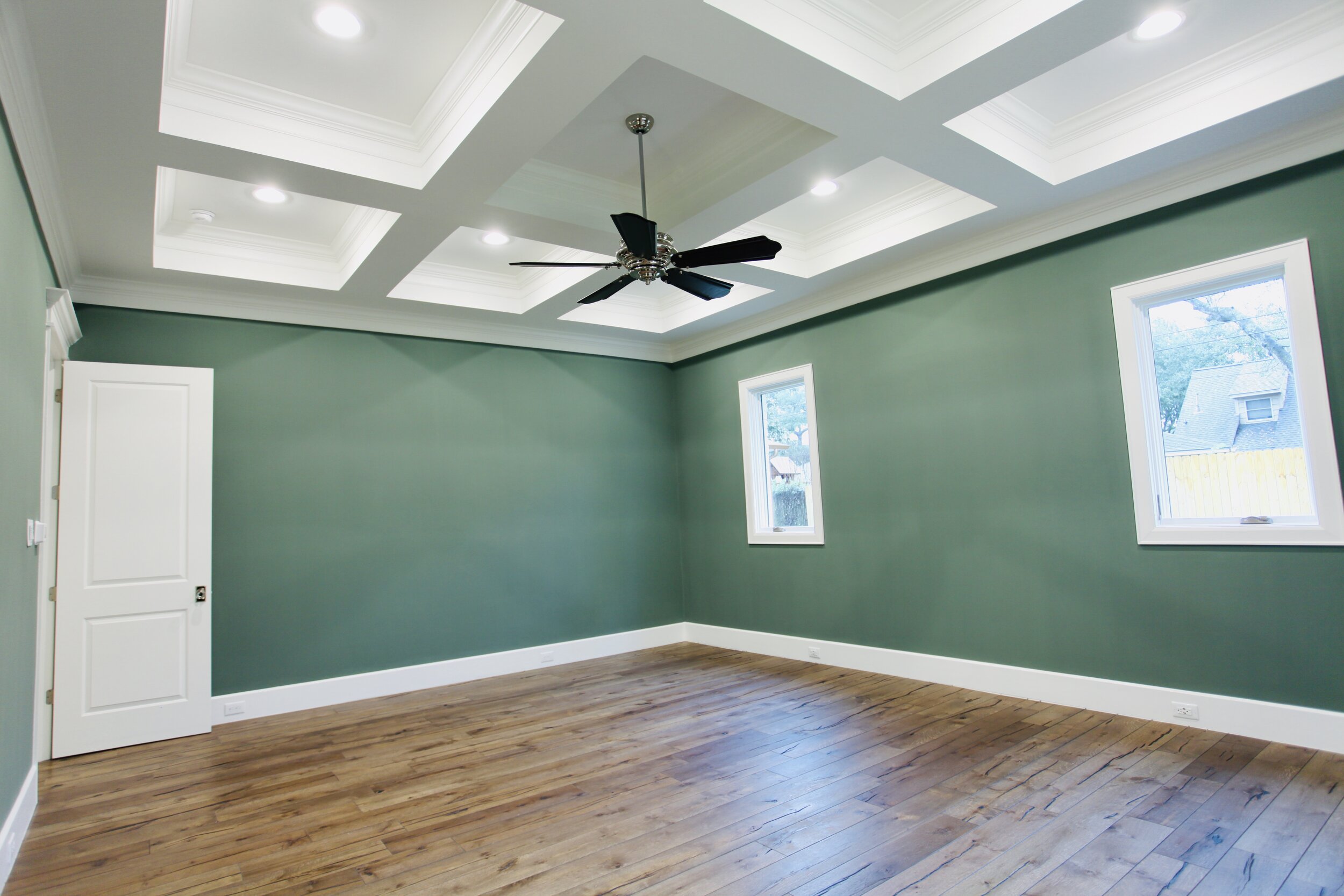
Boxed coffered ceiling in the master bedroom.

Boxed coffered ceiling in the master bedroom.

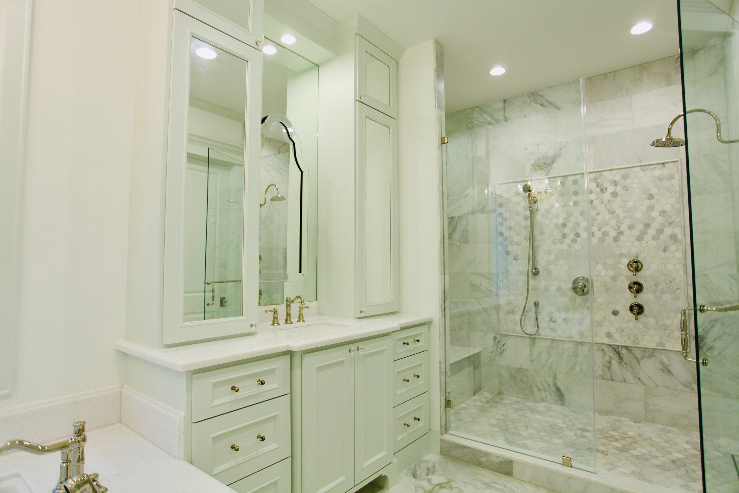
Master bathroom with custom cabinetry, luxury spa, marble finishes, and a decorative mirror uniquely layered on a mirror.

Master bathroom with custom cabinetry, luxury spa, marble finishes, and a decorative mirror uniquely layered on a mirror.

fullsizeoutput_7b8.jpeg
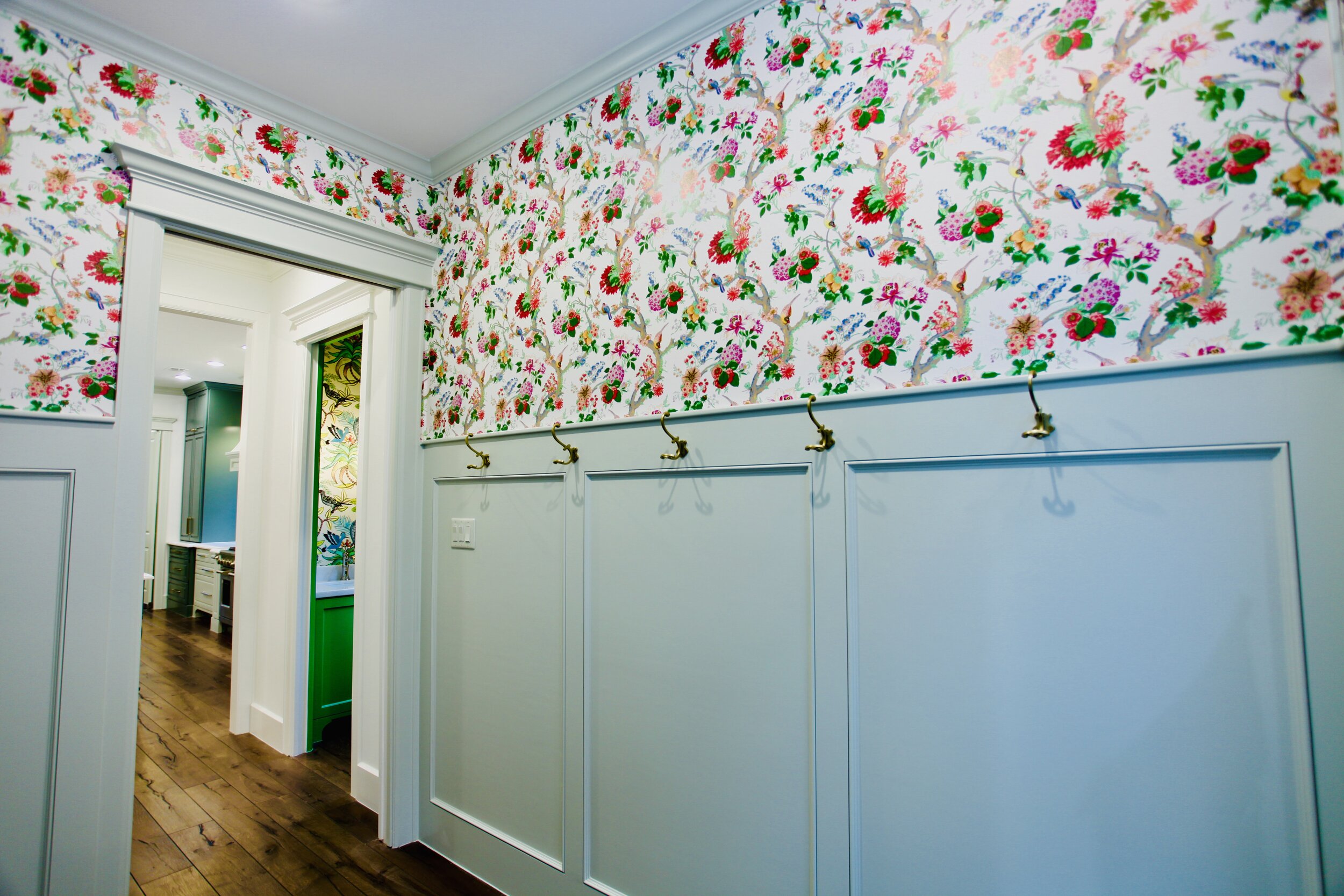
The client hand selected wallpaper for four rooms of her house (2 powder baths, craft room, and mud room). As you can see, she chose vibrant colors and was not afraid to go bold.

The client hand selected wallpaper for four rooms of her house (2 powder baths, craft room, and mud room). As you can see, she chose vibrant colors and was not afraid to go bold.

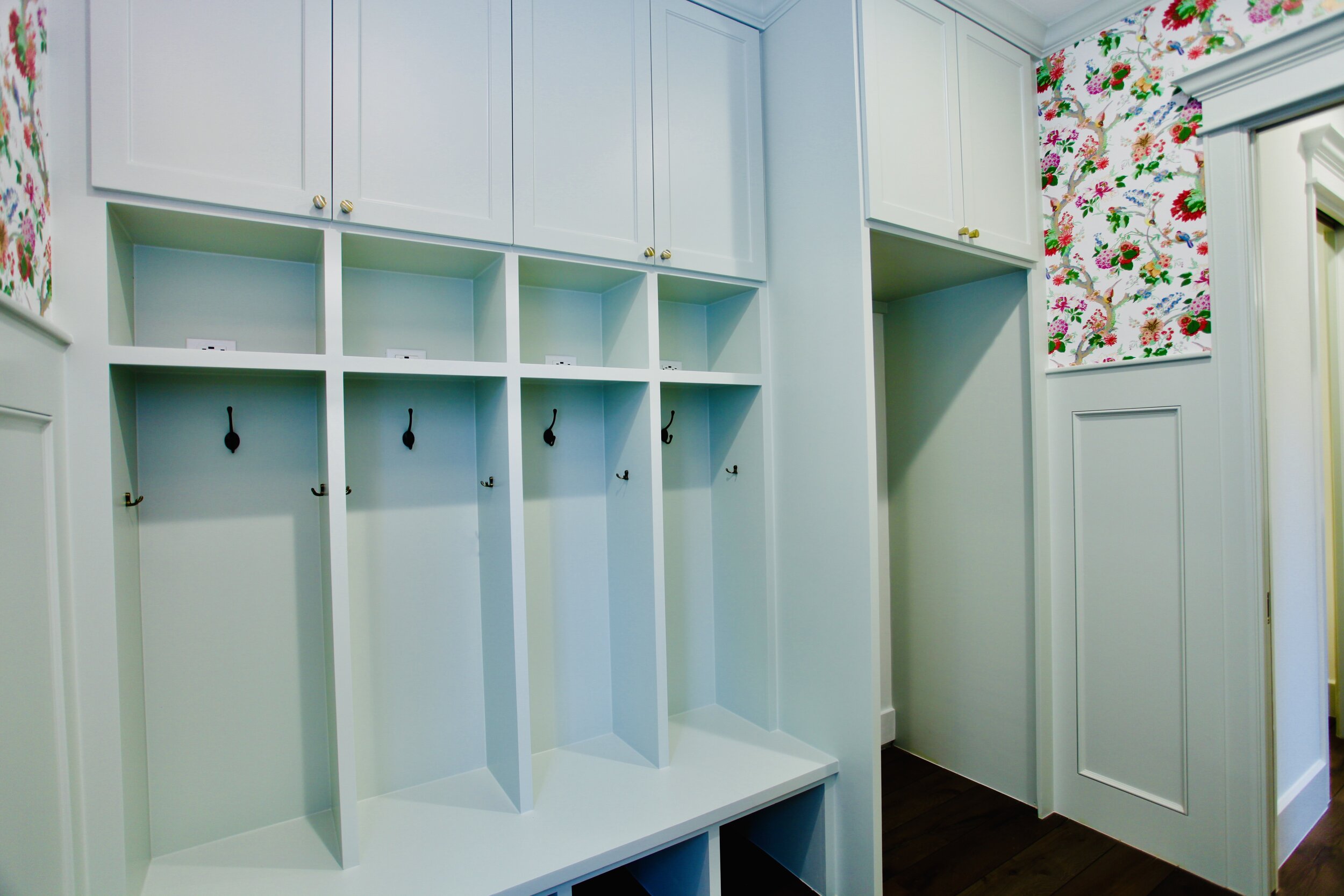
Mud room open lockers.

Mud room open lockers.

After she selected the wall paper, we painted the cabinets and trim to match the colors. This is the “cabana bath” next to the mud room.

After she selected the wall paper, we painted the cabinets and trim to match the colors. This is the “cabana bath” next to the mud room.

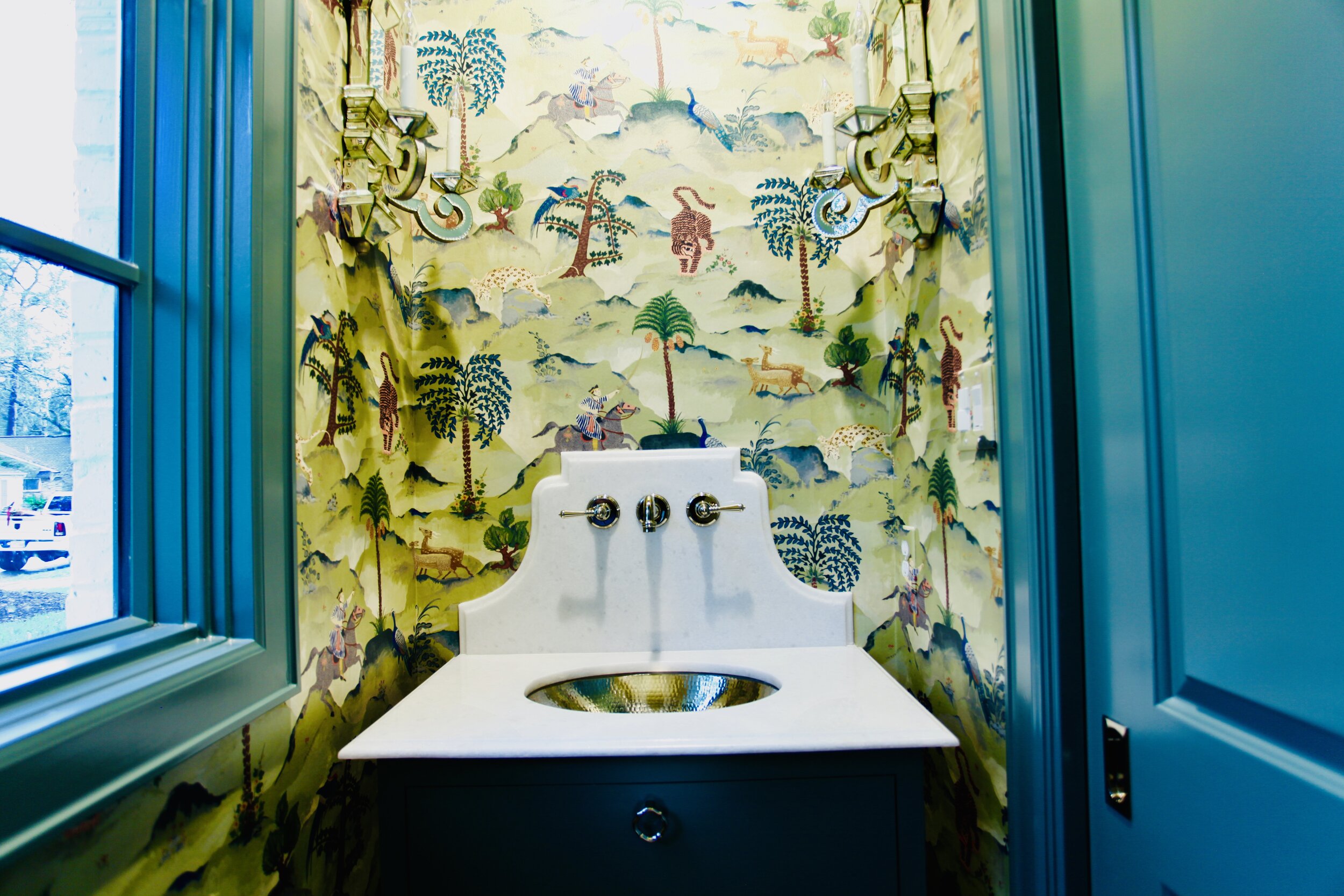
This is the powder room that will mostly be used for guests and thus has a more elegant feel.

This is the powder room that will mostly be used for guests and thus has a more elegant feel.